Just three countries—the U.S., Saudi Arabia and Russia—make up the lion’s share of global oil supply. Here are the biggest oil producers in 2022. Read more

This map explainer looks at the Gaza Strip from a structural point of view, delving into geography, infrastructure, demographics, and more. Read more
How would all the people in the world be spread out if there were only 1,000 people on Earth? This interactive map examines the breakdown. Read more
Here’s a preview of our much-anticipated 2024 Global Forecast Series, the U.S. military’s annual report on China and and much more. Read more
Global debt has soared since the pandemic. Which countries have the biggest stockpile of debt outstanding in 2023? Read more

Get Visual Capitalist’s new app, Voronoi, and discover the world’s most interesting data and stories, all on one trusted platform. Read more
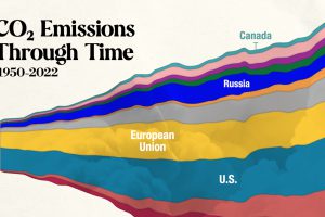
In this streamgraph, we break down global CO2 emissions between 1950 and 2022 using data from Berkeley Earth and Global Carbon Project. Read more
See the most popular, most discussed, and most liked visualizations on our new data storytelling app Voronoi in December. Read more


