

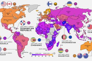
Global happiness levels are determined by several different factors. Here’s a look at the happiest and unhappiest countries in every region. Read more
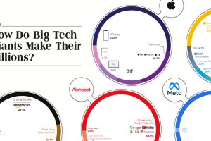
The Big Five tech companies made $1.4 trillion in revenue combined—more than Mexico’s entire GDP. Here’s how they earned it all. Read more
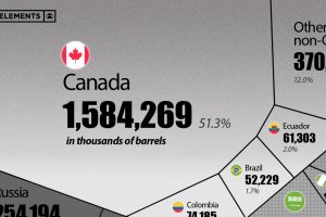
This visualization breaks down U.S. oil imports by country for 2021, showing the split by OPEC and non-OPEC nations. Read more

Here’s a sneak preview of features that VC+ members will have delivered straight to their inboxes in May 2022. Read more
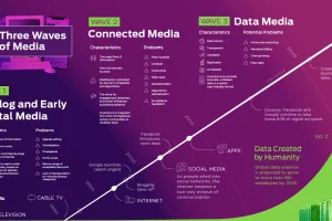
Media and information delivery is transforming at an increasing pace. Here’s why the future will be more data-driven, transparent, and verifiable. Read more
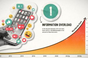
This era of data abundance should be propelling humankind forward, but valuable insights are often lost in the noise. Data storytelling holds the key. Read more

In this infographic, we catalog 33 problems with the social and mass media ecosystem. Read more

Visual Capitalist is launching a new app that will combine powerful data and visual storytelling. Learn more about how to support it here. Read more
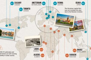
Which cities rank as the best places to live worldwide? This map reveals the world’s most and least livable cities. Read more
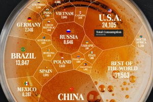
Which countries drink the most beer? China ranks number one due to its sheer size, and the Czech Republic comes out on top, per capita. Read more