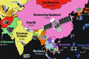
Asia’s exports span a wide range, from petroleum to technology components and textile products. Read more
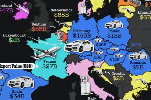
Cars and petroleum dominate the European Union exports. Read more
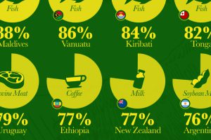
Which countries are most heavily dependent on agricultural exports to fuel their economies? We visualize the data in this chart. Read more
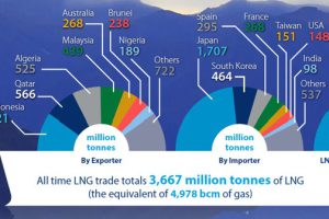
50 Years of LNG On October 12, 1964, the first commercial shipment of liquified natural gas (LNG) was made between Algeria and Canvey Island in the United Kingdom. From the… Read more
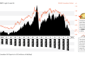
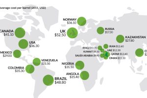
The oil plunge has wreaked havoc on the Canadian dollar. Now at 13-yr lows and expected to go lower, we explain the relationship between oil and the loonie. Read more
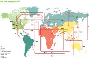
Every day, 93 million barrels of oil are consumed by the global economy. How does this oil change hands? This map visualizes the global oil trade. Read more
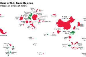
The U.S. has run a trade deficit for 40 years now. Where does that net foreign spending go? This map visualizes the data from 2015. Read more
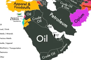
If we could only show you one map to explain the economy of the Middle East, it would be this one. Read more
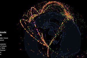
Use this interactive map to explore fascinating data on international trade. Which countries trade with each other, and which are stuck as hermits? Read more


