

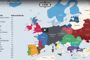
The history of Europe is breathtakingly complex, but this animation helps makes sense of 2,400 years of change on the European map. Read more
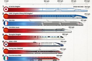
Which country has the fastest trains in the world, and how fast can they go? Read more
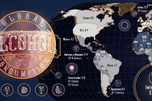
Which countries are the world’s biggest alcohol drinkers? This interactive map explores global alcohol consumption per capita. Read more
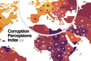
Which countries are the most (and least) corrupt? This map shows corruption around the world, and the movers and shakers over the last decade. Read more
This graphic visualizes Ukraine’s top international trading partners and the country’s most exported and imported products in 2020. Read more
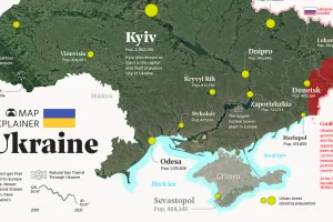
Ukraine has made the headlines due to the ongoing tensions with Russia. In this map infographic, we examine Ukraine from a structural point of view. Read more
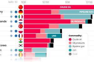
Here are the top importers of Russian fossil fuels since the start of the war. Read more
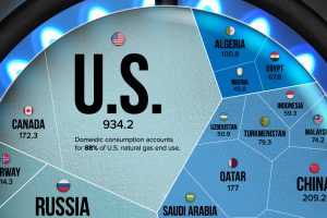
Natural gas prices have risen since Russia’s invasion of Ukraine. This visualization highlights the world’s largest natural gas producers. Read more
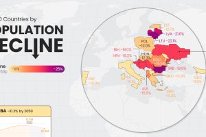
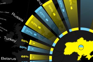
Population decline is a rising issue for many countries in Eastern Europe, as well as outliers like Japan and Cuba. Read more
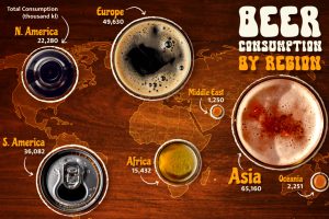
Which region has led global beer consumption for 15 consecutive years? This graphic shows the top beer-drinking regions worldwide. Read more