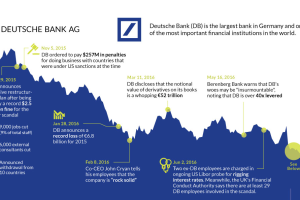
The fate of Germany’s largest bank appears to be sealed. This timeline shows the fall of Deutsche Bank, one of Europe’s most crucial financial institutions. Read more
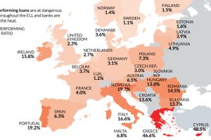
Despite the potential negative economic consequences, there is one reason a Brexit makes sense: non-performing loans and Europe’s troubled banking sector. Read more
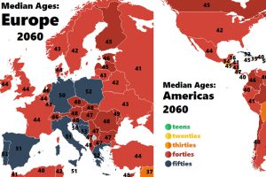
How fast are countries in Europe and the Americas aging? These colorful animations show how the median age is projected to change up until the year 2060. Read more

How long does it take English speakers to learn various languages? Spanish may be a quick one, but Japanese will likely test your resolve. Read more

The average age for adults to move out in the top seven countries—all from the same region—is either at or above 30. Read more

Wheat production is largely diversified around the world, though three major producers emerge: China, India, and Russia. Read more
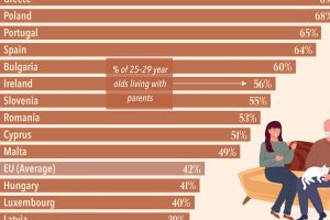
Analyzing the share of 25–29 year olds benefitting from or contributing to household incomes reveals the countries where adults still live at home. Read more
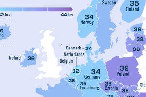
Less wealthy countries of Europe tend to have longer workweeks. Here’s how many hours Europeans work each week, by country. Read more

After decades Asia’s population boom is slowing down. However, birth trends indicate there’s a new population hotspot. Read more

These maps of North America and Europe use a deceivingly simple method to plot population density: replacing each town with a single dot. Read more

