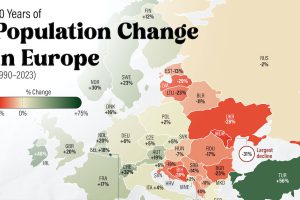
There’s an east-west divide when it comes to Europe’s population growth in the last 30 years. And it’s very apparent in this map. Read more
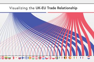
The UK and the EU have recently laid out new terms for their relationship. So how important is the UK’s trade with the EU? Read more
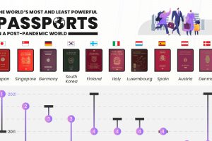
Ranking the the world’s most powerful passports based on access to visa-free destinations. Where does your country fall on the list? Read more
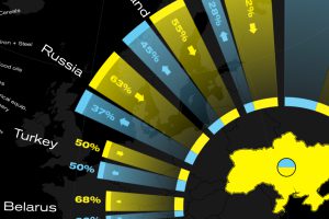
This graphic visualizes Ukraine’s top international trading partners and the country’s most exported and imported products in 2020. Read more
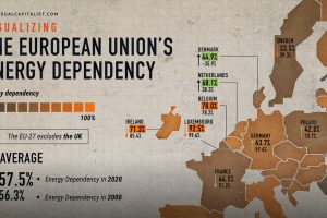
The EU’s energy dependency has become a major issue amid Russia’s invasion of Ukraine. See what the data says in this infographic. Read more
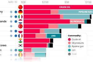
Here are the top importers of Russian fossil fuels since the start of the war. Read more
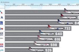
What type of aircraft do the world’s largest airlines use? This infographic breaks down the airline fleets of major carriers Read more
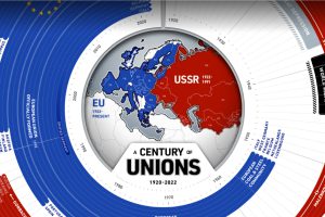
This year marks 100 years since the birth of the Soviet Union. How have countries in and near Europe aligned themselves over the last century? Read more
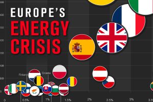
As European gas prices soar, countries are introducing policies to try and curb the energy crisis. Read more
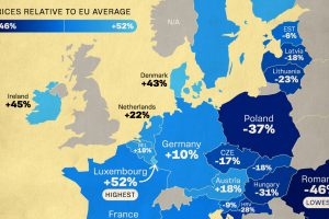
Which EU countries are the cheapest and the most expensive? See how prices compare relative to the EU average. Read more

