
Brexit happened and markets are turned upside-down. However, this may only be just the beginning… Read more
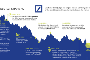
The fate of Germany’s largest bank appears to be sealed. This timeline shows the fall of Deutsche Bank, one of Europe’s most crucial financial institutions. Read more
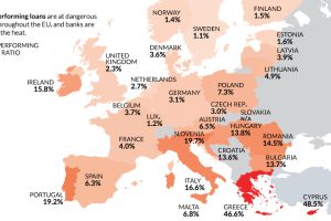
Despite the potential negative economic consequences, there is one reason a Brexit makes sense: non-performing loans and Europe’s troubled banking sector. Read more

Roughly 75% of all financial market volume comes from automated trading. Here’s how algorithms caused the flash crash in the British pound in early October. Read more
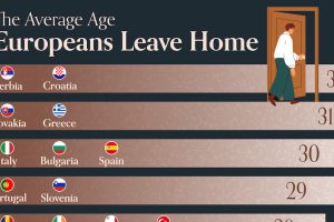
The average age for adults to move out in the top seven countries—all from the same region—is either at or above 30. Read more
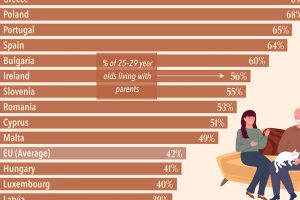
Analyzing the share of 25–29 year olds benefitting from or contributing to household incomes reveals the countries where adults still live at home. Read more
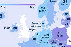
Less wealthy countries of Europe tend to have longer workweeks. Here’s how many hours Europeans work each week, by country. Read more
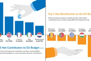
As Brexit looms, the EU budget is under the microscope. Learn which countries contribute the most—and least—to the bottom line in this chart. Read more
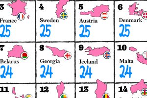
All EU member states are required by law to ensure a minimum of 20 days (four weeks) of paid time off in their labor codes. Read more
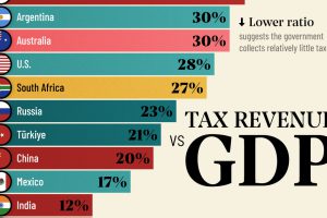
Measuring the ratio of tax revenue to economic size reveals the government’s ability to spend on public services. Read more

