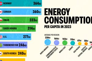
In 2023, the world consumed 2% more energy compared to 2022. Which countries consumed the most energy per capita? Read more

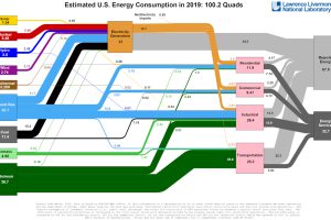
This incredible flow diagram shows how U.S. energy use broke down in 2019, including by source and end sector. Read more

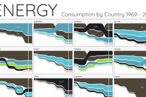
For the last 50 years, fossil fuels have dominated energy consumption. This chart looks at how the energy mix is changing in over 60+ countries. Read more

