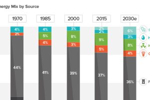
See how America’s energy mix has evolved from 1970 until today, as well as a projection for the energy sources to be used in the year 2030. Read more
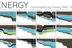
For the last 50 years, fossil fuels have dominated energy consumption. This chart looks at how the energy mix is changing in over 60+ countries. Read more
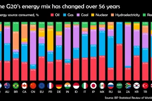
Watch how the energy mix of G20 countries has evolved over the last 50+ years. Read more
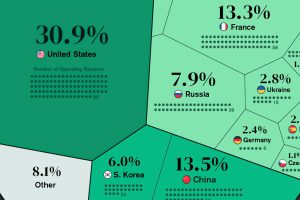
Nuclear power accounted for 10% of global electricity generated in 2020. Here’s a look at the largest nuclear power producers. Read more
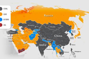
Asia is on its way to account for half of the world’s electricity generation by 2025. How is this growing demand currently being met? Read more

