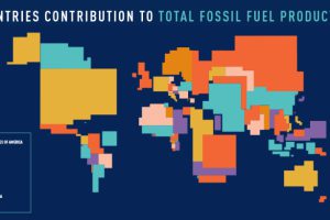
These four animated cartograms show the nations leading the world in fossil fuel production, in terms of oil, gas, coal, and total hydrocarbons. Read more
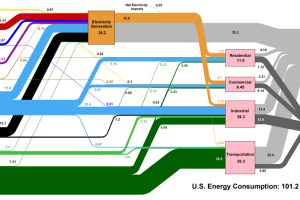
This interesting diagram breaks down all U.S. energy use by both source and industry, and everything that happens in between. Read more
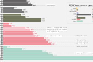
As global population grows, our energy demand grows as well. Here are the largest energy sources in the world and how much electricity they generate. Read more

Microsoft aimed for carbon neutrality by 2030. Now its electricity use and carbon emissions are on the rise. Read more
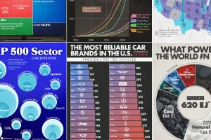
We round up the most popular, most discussed, and most liked visualizations of the month on Voronoi, our new data storytelling platform. Read more
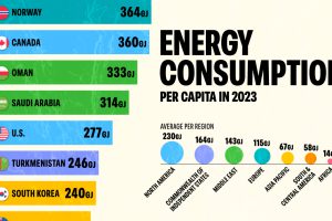
In 2023, the world consumed 2% more energy compared to 2022. Which countries consumed the most energy per capita? Read more
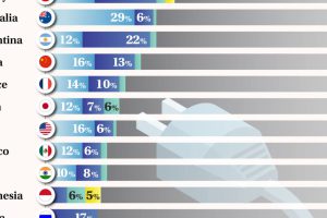
Brazil leads the G20 in renewable electricity. Read more
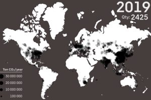
See every major coal power plant ever commissioned on this animation, which covers a time period from 1927 until 2019. Read more


