

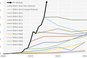
Forecasting the future of energy is not an easy task. These charts show how the experts have fared at forecasting solar over recent decades. Read more
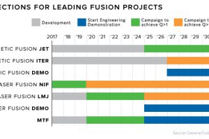
Fusion is the epitome of ‘high risk, high reward’ research. Each new technological breakthrough brings us a step closer to power that’s too cheap to meter. Read more

These satellite maps visualize where different energy sources, like fossil fuels, nuclear, or renewables, are used to generate electricity. Read more

This interactive chart shows the breakeven prices that oil-rich countries need to pay for imports. We also dive into Venezuela’s specific crisis as well. Read more
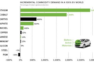
Based on the teardown of a Chevy Bolt, this chart reveals how annual commodity demand would be affected in a hypothetical 100% EV world. Read more
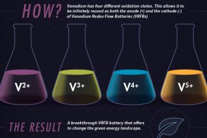
Using vanadium’s 4 different oxidation states, vanadium redox flow batteries (VRFBs) could be a crucial step forward for energy storage in the green revolution. Read more
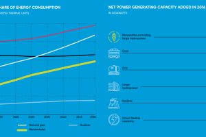
In 2016, more net capacity was added for clean energy than all other types combined. Who’s adding renewable capacity, and how much are they investing? Read more
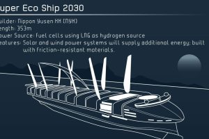
These examples of concept ships are being built to use higher amounts of AI and green energy. See the future of shipping in this infographic. Read more

This graphic lists the largest sector ETFs by AUM in 11 major stock sectors, including technology, energy, and healthcare. Read more

One in four federal government workers have a union membership. State and local governments rates are even higher. Read more