

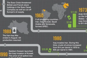
Oil is the world’s most traded commodity and a staple for investors – this infographic shows the volatile history of crude oil markets. Read more
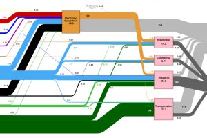
This massive diagram shows all energy created in the U.S., and where it goes. It’s not sexy, but it gives a great 10,000 ft overview of energy consumption. Read more
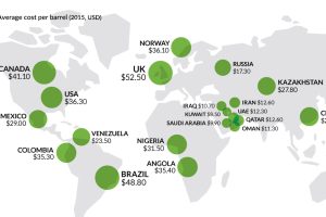
It’s been two years since the oil price crash. This chart looks at three sets of oil data, while we check in on the economies most ravaged by low oil… Read more
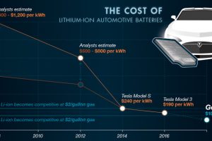
In Part 3 of The Battery Series, we look at the market for rechargeable batteries, as well as the exploding demand for lithium-ion batteries in particular. Read more
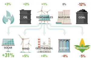
How is U.S. energy consumption shifting? This week’s chart looks at the rate of change in the use of different energy sources, including future projections. Read more
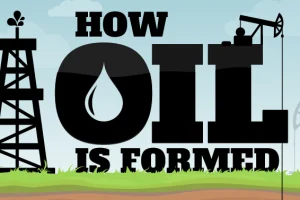
This infographic shows how oil is formed, along with some history, uses, and types of oil found. It also presents a lesser-known theory on how oil forms. Read more
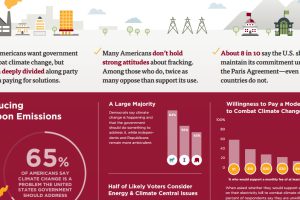
This survey of over 1,000 Americans tells you what people actually believe about fracking, coal, climate change, and other hot button energy issues in the U.S. Read more

Which new sources of energy have promise? This infographic highlights the upcoming technologies that may provide the alternative energy sources of the future. Read more
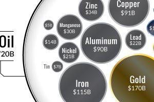
Ever wonder why the oil industry has so much influence? This chart shows that all metal markets combined don’t even come close to touching the oil market! Read more
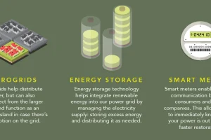
How does electricity to your home? This infographic shows how the power grid works, along with the brand new innovations coming to a grid near you. Read more