

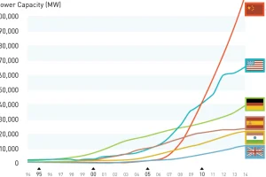
The most recent statistics show that China now has more total wind capacity than the United States, India, and Spain combined. Read more
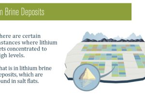
Lithium brine exploration has several benefits associated with it from a cost perspective. In this infographic, we compare it to hard rock exploration and highlight the differences. Read more
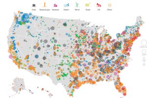
This series of data visualizations shows how the United States has generated its electricity so far in 2015 by energy source and size of each power plant. Read more
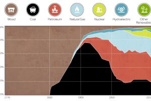
This chart shows the history of America’s energy supply based on energy source. This brief history covers all from wood-powered locomotives to solar panels. Read more
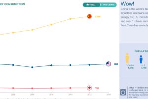
Compare the United States, China, and Canada side-by-side to see the differences in how these energy titans consume, produce, and import/export energy. Read more
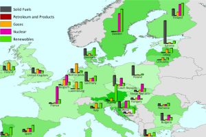
This series of charts and maps show an overview of Europe’s energy consumption, as well as consumption (per capita) by country and source. Read more

By the time you finish reading this infographic, there will be 3,810 new devices connected to the internet of things. Read more

This infographic shows how five global brands are already using large amounts of renewable energy, including Microsoft, Google, Ikea, Sony, and Walmart. Read more
The majority of the 391 nuclear reactors in global operation were built many years ago, and aging reactors are beginning to be a problem for the industry. Read more
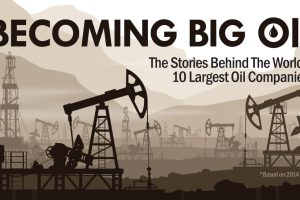
The 10 largest oil companies generated a massive $3.26 trillion in revenue last year. How did Big Oil come to be? This infographic takes a look. Read more