

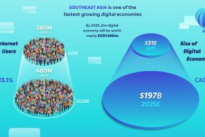
Tech is driving growth in Southeast Asia, and the region will soon boast a $200 billion digital economy in just a few years. Read more
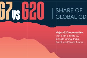
The G7’s share of global GDP has been shrinking since the early 2000s. See the full story in this infographic. Read more
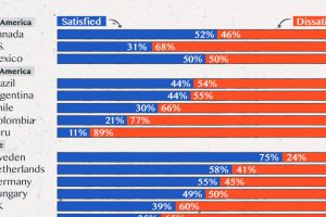
Satisfaction with democracy has declined in recent years, particularly in high-income nations. Read more
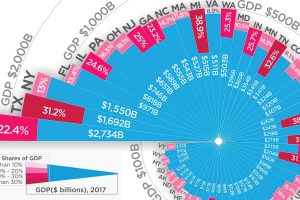
Which state could be hit hardest by a trade war? Here is every U.S. state organized by total economy size, and the share tied to international trade. Read more
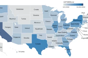
Each state has a GDP that is comparable in size to that of an actual country. This map shows it all, plus a full list of state economies and countries. Read more
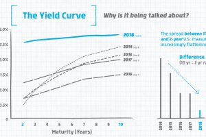
The financial world is abuzz about something called the yield curve – this infographic explains what it is, and why an inversion matters to markets. Read more
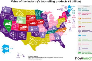
Which industries reign supreme in the United States? This map breaks down the most profitable industry, state by state. Read more
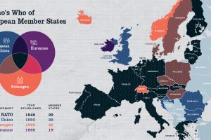
Europe has members in at least four major treaty groups. This map shows how these groups fit into the big picture of Europe’s member states. Read more
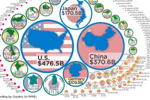
Just four countries (U.S., China, Japan, and Germany) account for nearly two-thirds of global expenditures on R&D. Here’s global data on R&D visualized. Read more
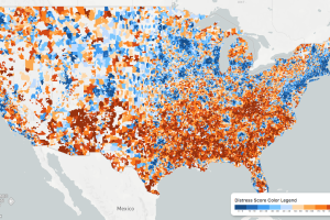
While the U.S. economic picture remains quite rosy, things change quickly when you zoom to the local level. This map shows the country’s distressed communities. Read more