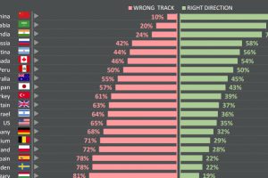
Do citizens think that their countries are heading in the right direction – or are they going down the wrong path? See survey results for 25 countries. Read more
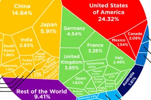
See how the multi-trillion dollar pie of the global economy gets divided between countries, based on the latest data from the World Bank from February 2017. Read more
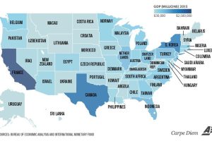
Texas is the size of Canada, and California is similar to France. Even tiny Vermont is comparable to a country’s GDP (Bahrain). Read more
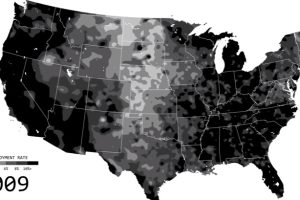
See the ebbs and flows of regional unemployment in the United States in this animated map from 1990 until 2016. Read more
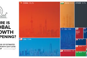
By 2019, the global economy is projected to expand another $6.5 trillion. Today’s chart shows which countries will help to fuel this global growth. Read more
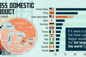
We don’t think of the Great Lakes as its own economy, but maybe we should. It’s tightly integrated by trade, and generates $6 trillion in GDP each year. Read more
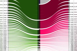
Canada is the largest international trade partner for most U.S. states – use this visualization to see how connected every state is to neighbors to the north. Read more
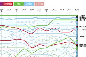
A ranking of the most sophisticated economies in the world – and also a look at the movers and shakers in terms of economic complexity. Read more
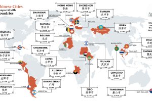
You’ve probably heard of Chinese cities like Beijing, Hong Kong, and Shanghai – but those actually only scratch the surface of China’s economic picture. Read more

In this timeless animated video from 2013, billionaire hedge fund founder Ray Dalio eloquently explains how the world economy works in just 30 minutes. Read more

