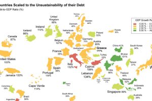
What if the world was remapped based on national debt levels? What would the largest country be? See the world map of debt. Read more
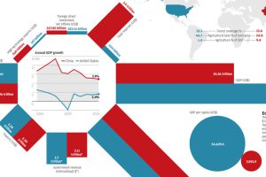
Today’s infographic looks at the economic differences between China and the United States: total reserves, GDP per capita, demographics, and much more. Read more
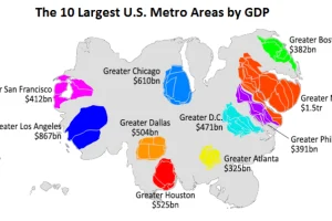
This animation uses county-level GDP data to re-size a U.S. map based on the economic contributions at a local level. Read more
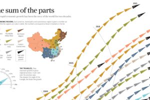
China’s economic miracle over the last 20 years is the sum of its parts, with each region of the country contributing to growth in different ways. Read more

This graphic shows median income by state in 2024, adjusted for cost of living. Can you guess where it’s the highest? Read more
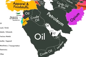
If we could only show you one map to explain the economy of the Middle East, it would be this one. Read more
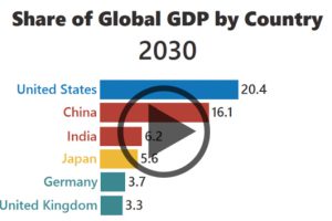
The rise of Asia has been swift. Here’s three GIFs that show the speed of China in becoming an economic power house – and how India is hot on their… Read more
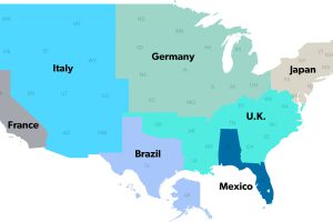
The United States has a $18 trillion economy – the biggest in the world. But here’s another way of looking at it, using three interesting maps. Read more
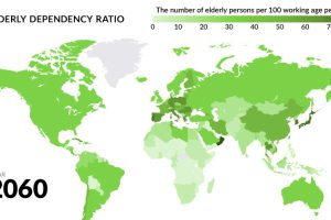
Globally, fertility rates have decreased by about half since 1960. What will happen to the economy when the world’s aging population begins to retire? Read more
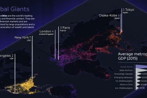
The world’s largest 123 cities generate an astonishing $36 trillion in GDP per year. This infographic breaks these global cities down into seven typologies. Read more

