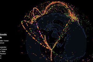
Use this interactive map to explore fascinating data on international trade. Which countries trade with each other, and which are stuck as hermits? Read more
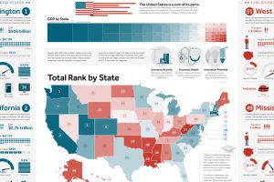
This giant infographic has state economies ranked from best to worst, based on an overall score comprised of 27 different metrics. Read more
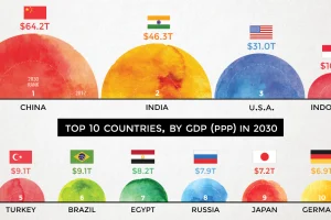
According to projections by a prominent multinational bank, 7 of the world’s 10 largest economies will be in emerging markets in 2030. Read more
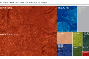
Global economics is effectively a numbers game – here are the countries and regions projected to contribute the most to global growth in 2019. Read more
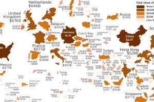
Which economies are the world’s biggest importers of goods? See for yourself in this visualization, which resizes countries based on the value of imports. Read more
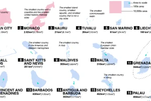
From Vatican City to Fiji, take a closer look at the world’s 100 smallest countries and their spheres of influence. Read more

The Dow Jones Industrial Average is constantly evolving. This chart tracks which companies have come and gone since the inception of the index in 1928. Read more
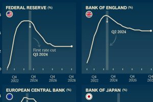
Which economies are expected to see interest rates rise, or fall? We highlight IMF forecasts for international interest rates through 2028. Read more

