
Ever wonder how your state compares in terms of economic output? This simple visualization compares the economies of every U.S. state. Read more

Today’s stunning map ranks the world’s most powerful megaregions — together, they contribute a whopping $28 trillion to the global economy. Read more
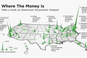
The total U.S. GDP stands at a whopping $21 trillion, but which metro areas contribute to the most in terms of economic output? Read more

It takes Poland, Sweden, Austria, Norway, and 18 other countries together to match the might of Germany’s economy. Read more

How much does each country contribute to the $105 trillion world economy in 2023, and what nations are seeing their nominal GDPs shrink? Read more
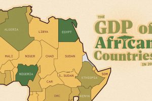
The top three economic powerhouses of Africa contribute more than one-third to the African economy. We rank the nations of the world’s second-largest continent by 2024 GDP estimates. Read more
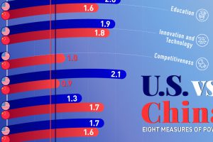
The balance of power between the U.S. and China is influenced by many forces, spanning from trade and military strength to economic output. Read more
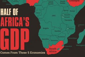
The Big Five African economies outperform the rest of the continent with only 44% of the population. Read more

