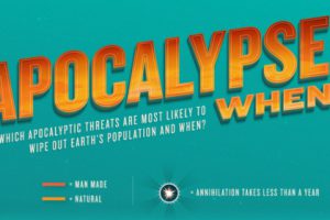
This tongue-in-cheek infographic guide will prepare you for potential doomsday scenarios the Earth may face over the next million years. Read more
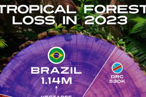
The world lost the equivalent of almost ten soccer fields of tropical forest per minute last year. Read more
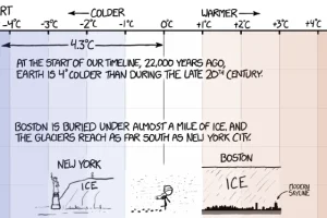
This simple and hilarious graphic is a must-see because of the excellent context it gives on changes in the earth’s temperature over the last 22,000 years Read more

95% of the world’s oceans remain unexplored. Today’s video helps shed some light on just how deep the ocean is and what little we do know about the deep sea. Read more
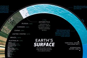
There are 510 million km² of area on the Earth, but less than 30% of this is land. Here’s the share countries make up of the Earth’s surface. Read more
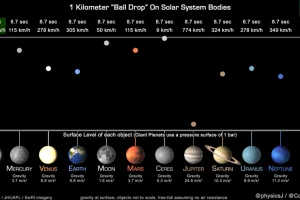
This unique animation, created by a planetary astronomer, compares and highlights the gravitational pull of the planets. Read more
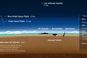
Earth’s atmosphere is thousands of miles long, but only a fraction can sustain life. Here’s a look at how small Earth’s habitable zone is. Read more
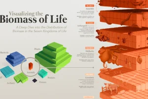
Our planet supports nearly 8.7 million species. We break down the total composition of the living world in terms of its biomass. Read more
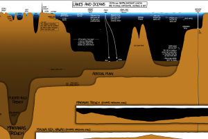
A unique and entertaining graphic that compares the depth of the world’s lakes and oceans, as well as the deepest holes ever drilled. Read more

How much does a space flight cost? Here’s a look at the cost per kilogram for space launches across the globe since 1960. Read more

