

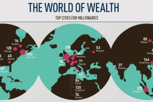
This infographic breaks down the top cities for millionaires sorted by density and total population, as well as providing demographics. Read more
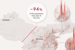
1.4 billion people live in a country stretching across 3.7 million square miles. Yet 94% of China’s population lives in only one half. Read more
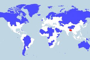
More people live in the tiny red region than all of the blue areas combined. This map really shows the disparity in population density throughout the globe. Read more
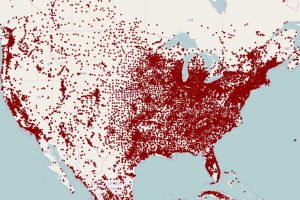
These maps of North America and Europe use a deceivingly simple method to plot population density: replacing each town with a single dot. Read more

This animation shows the population density of U.S. counties between 1790 and 2010, showing the westward expansion of the country’s population. Read more
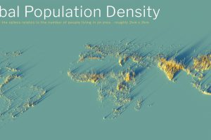
What does population density look like on a global scale? These detailed 3D renders illustrate our biggest urban areas and highlight population trends. Read more