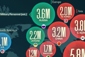
The U.S. controls 40% of global aircraft carrier fleet. Read more
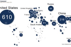
This map shows global defense spending by country – and it puts U.S. military spending into perspective. Read more

NATO members have significantly increased their defense spending over the past two years. Read more
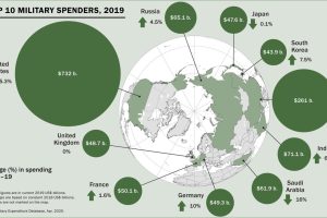
Global military spending surpassed $1.9 trillion in 2019, but nearly 75% of this total can be traced to just 10 countries. Read more
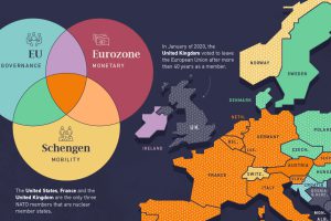
Europe’s member states are part of one or more of the four major treaty groups. Here we map the countries that are part of these groups. Read more
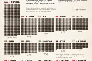
The tank remains the backbone of modern twenty-first century armies. This infographic shows what countries have the largest combat fleets. Read more
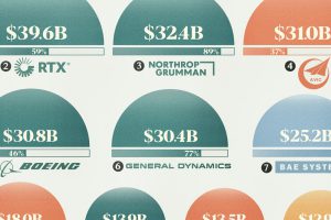
With billions in defense contracts handed out annually, who are the key players profiting? View this graphic to find out. Read more

In 2023, only 11 member countries reached NATO’s target of spending 2% of their country’s GDP on defense. Read more
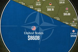
The U.S. accounts for 68% of NATO’s total combined defense spending. Read more


