Hydroelectric dams generate 40% of the world’s renewable energy, the largest of any type. View this infographic to learn more. Read more

As the market for low-emission solutions expands, China dominates the production of clean energy technologies and their components. Read more
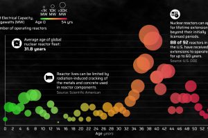
Explore the age distribution of the 422 nuclear reactors operating globally in this infographic. Read more

Here’s a preview of the 2023 Utility Decarbonization Index, which tracks the decarbonization progress of the largest U.S. utilities. Read more
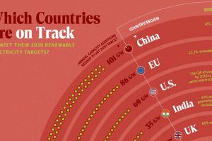
In this graphic, we visualize whether major electricity-consuming countries are on track to meet their 2030 renewable energy targets. Read more

Despite concerns about nuclear waste, high-level radioactive waste constitutes less than 0.25% of all radioactive waste ever generated. Read more
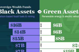
Sovereign wealth funds have scaled up their green investments in the push towards decarbonizing the global economy. Read more


