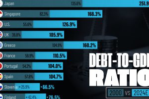
See how much the debt-to-GDP ratios of advanced economies have grown (or shrank) since the year 2000. Read more

Older, better-educated adults are winning the savings game, reveals a January survey by the National Opinion Research Center at the University of Chicago. Read more

The 20 nations featured in this graphic each owe billions in debt to China, posing concerns for their economic future. Read more

Argentina tops the ranking, with a debt equivalent to 5.3% of the country’s GDP. Read more

We visualized the results of a 2024 student wealth survey to gain insight into how students are fairing financially. Read more

We round up the most popular, most discussed, and most liked visualizations of the month on Voronoi, our new data storytelling platform. Read more

What do Millennials think about money? This infographic covers interesting points on Millennial beliefs in personal finances. Read more

How did the European Debt Crisis begin? This video explains how countries in the Eurozone built up such troublesome debt. Read more


