

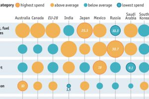
Have you ever wondered how much Russians spend on alcohol compared to different countries? Or how much households in Saudi Arabia allocate to recreation? Read more
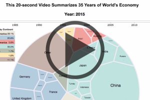
Watch the world economy evolve over 35 years in this video, which captures the breakdown of economic output by country. Read more
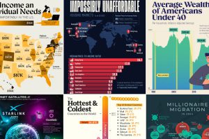
We round up the most popular, most discussed, and most liked visualizations of the month on Voronoi, our new data storytelling platform. Read more
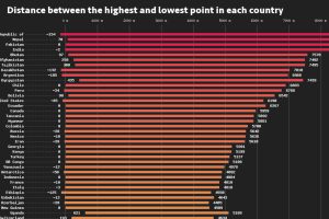
This data visualization compares the elevation span of every country, ranging from the mountain peaks of Bhutan, to the Dead Sea depression. Read more
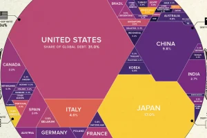
What share of government world debt does each country owe? See it all broken down in this stunning visualization. Read more
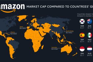
How do the big tech giants compare to entire countries? Here’s how Apple, Microsoft, and Amazon’s market caps stack up against national GDP. Read more
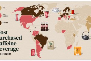
Do you drink coffee, tea, or cola? Each country has their own drink preference. Read more
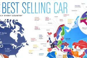
From American trucks to European sedans, this map shows the best-selling vehicles in the world. Read more
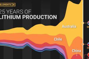
Lithium production has grown exponentially over the last few decades. Which countries produce the most lithium, and how how has this mix evolved? Read more