

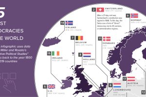
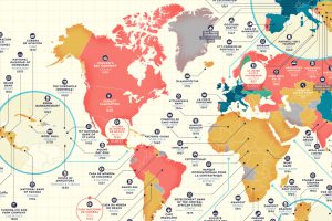
This map shows the 25 oldest democracies in the world, based on how long current democratic governments have been in continuous power. Read more
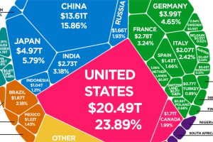
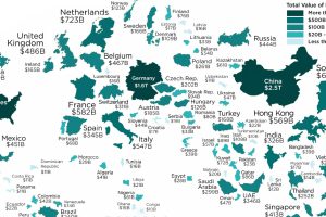
According to the latest World Bank data, the global economy is now $85.8 trillion in nominal terms. Here’s how it breaks down. Read more
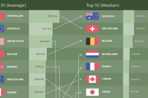
How do the rankings of the world’s most affluent countries change when using different metrics to measure wealth per capita? Read more
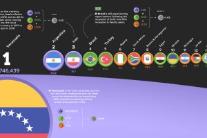
The annual Misery Index ranks the most and least miserable countries, based on four economic factors—unemployment, inflation, lending rates, and GDP growth. Read more
These are the largest international trade powerhouses of the world, resized on the map based on their annual exports in 2018. Read more
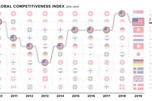
The world’s top countries excel in many fields—but there can only be one #1. How have the most competitive economies shifted in the past decade? Read more
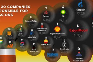
Since 1965, over ⅓ of the world’s cumulative carbon emissions can be traced back to just 20 fossil fuel companies. Who are the biggest contributors? Read more
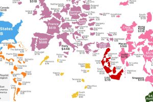
How much do your vacations contribute to your destination of choice? This visualization shows the countries that receive the most tourist spending. Read more
Which companies have stood the test of time? This detailed map highlights the oldest company in every country that is still in business. Read more
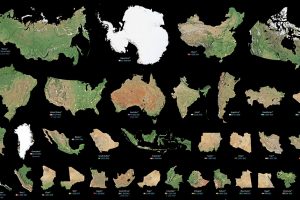
Maps can distort the size and shape of countries. This visualization puts the true size of land masses together from biggest to smallest. Read more