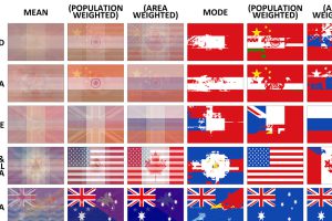
The average flag of the world, as well as different continents, if every flag were combined together. Also, a look at the building blocks of flag design. Read more
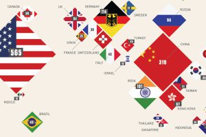
This infographic shows countries with the most billionaires, as well as the richest one in each country. Also, the odds of meeting a billionaire in each place. Read more
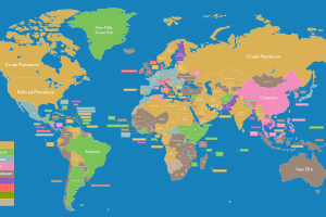
Whether your country’s top export is crude oil or flavored water, it’s all on this massive map that shows the most important export for every economy. Read more
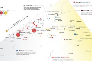
Can money buy happiness? It can up until a certain point, but as this giant chart shows, money and happiness are not always as aligned as one might guess. Read more
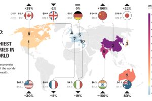
We break down the wealthiest countries in the world, which hold a whopping 73.5% of all private wealth. Also, a projection of future wealth in 10 years. Read more
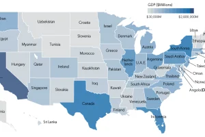
Each state has a GDP that is comparable in size to that of an actual country. This map shows it all, plus a full list of state economies and countries. Read more

With every country’s growth visualized on a logarithmic scale, we look at a few world population growth outliers and their unique stories. Read more
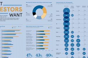
Are all investors saving for retirement, or do they have other investment goals in mind? Here’s a look at goals sorted by geography and generation. Read more
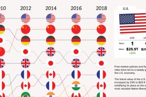
In a global marketplace, a country’s national image can be one of its most valued assets or a challenging liability. See how nation brands do in this ranking. Read more
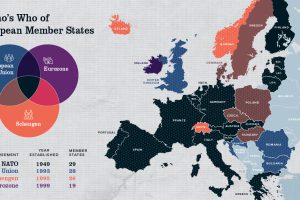
Europe has members in at least four major treaty groups. This map shows how these groups fit into the big picture of Europe’s member states. Read more

