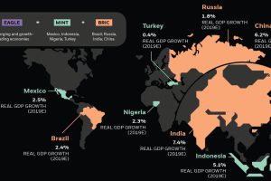
Emerging markets are ascending on the global stage and wielding more economic power—and it’s drastically altering the investment landscape. Read more
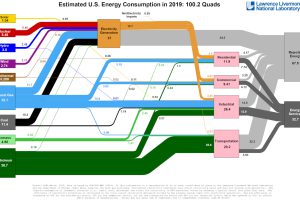
This incredible flow diagram shows how U.S. energy use broke down in 2019, including by source and end sector. Read more
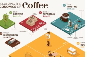
What makes your cup of coffee possible, and how much does it really cost? Here’s how the $200B coffee supply chain breaks down economically. Read more
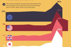
Were people more frugal during the pandemic or did they break the bank? This visual assesses the saving rates across different countries. Read more
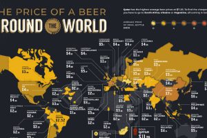
The global desire for beer prevails even in a pandemic. These maps compare the average beer price in 58 countries—just how much do we drink? Read more
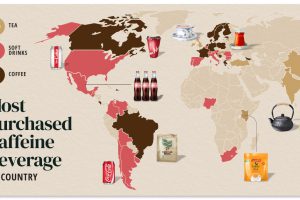
Do you drink coffee, tea, or cola? Each country has their own drink preference. Read more
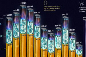
Governments pour nearly $500 billion into fossil fuel subsidies annually. This chart breaks down fossil fuel subsidies between 2010 and 2021. Read more
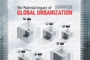
The world’s material consumption is expected to grow from 41 billion tonnes in 2010 to about 89 billion tonnes by 2050. This graphic shows the impact of urbanization. Read more


