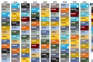
Coal came under scrutiny for its high carbon emissions at COP26, but many countries are forecasted to increase coal production until 2024. Read more
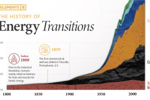
The current energy transition is unprecedented in both scale and speed. This infographic puts it into historical context. Read more
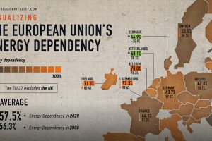
The EU’s energy dependency has become a major issue amid Russia’s invasion of Ukraine. See what the data says in this infographic. Read more
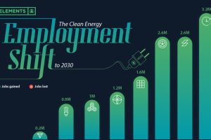
Will the clean energy transition create jobs, or will jobs be lost? Here is projected employment growth in clean energy and related sectors to 2030. Read more
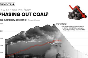
In 2021 coal-fired electricity generation reached all-time highs, rising 9% from the year prior. Here’s what it’d take to phase it out of the energy mix. Read more
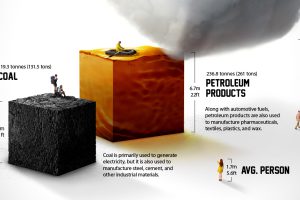
Each year the average American consumes more than 23 barrels of petroleum products. What does a lifetime of fossil fuel consumption look like? Read more

How much oil, coal, and natural gas do we extract each year? See the scale of annual fossil fuel production in perspective. Read more
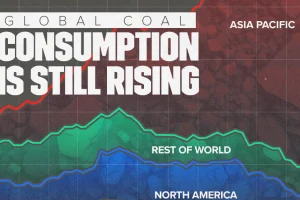
China remains the largest coal consumer, making up 56% of the global total. Read more
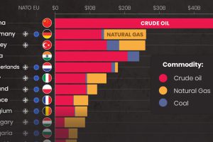
While Russia still makes billions from fossil fuel exports, revenues are declining. Here are the largest importers since the start of the invasion. Read more


