

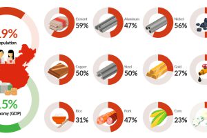
China uses more steel, cement, copper, nickel, and coal than the rest of the world combined. This chart shows China’s incredible demand for commodities. Read more
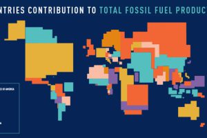
These four animated cartograms show the nations leading the world in fossil fuel production, in terms of oil, gas, coal, and total hydrocarbons. Read more
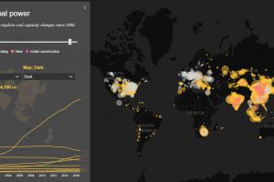
Today’s interactive map shows all of the world’s coal power plants, plotted by capacity and carbon emissions from 2000 until 2018. Read more
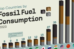
China and the U.S. account for nearly half of fossil fuel use. Read more
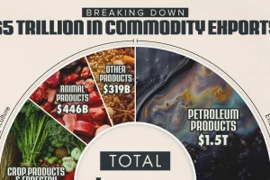
The energy sector accounts for 40% of the value of global commodity exports. And there’s a key product within it that dominates international trade. Read more
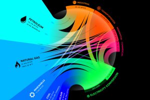
From renewables to fossil fuels, we’ve visualized the diverse mix of energy sources that powered U.S. energy consumption in 2020. Read more
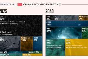
This infographic takes a look at what China’s energy transition plans are to make its energy mix carbon neutral by 2060. Read more
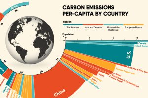
33.6 Gt of CO2 was emitted across the world in 2019. Here we visualize the global per capita CO2 emissions by country and region. Read more
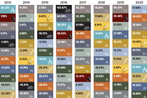
Energy fuels led the way as commodity prices surged in 2021, with only precious metals providing negative returns. Read more
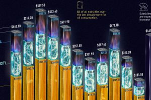
Governments pour nearly $500 billion into fossil fuel subsidies annually. This chart breaks down fossil fuel subsidies between 2010 and 2021. Read more