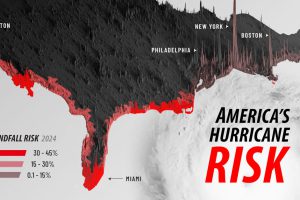
This map shows which areas have the most risk of a hurricane making landfall in 2024, along with major population centers. Read more
Just three regions have contributed 79% of global cumulative GHG emissions since 1850. See where they are in this graphic. Read more
The worst states to retire in are those that are expensive and cold. But there’s a surprising warm weather entry as well. Read more
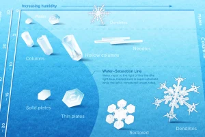
Snowflakes are ice crystals that are beautifully diverse and mysteriously symmetrical. We show what controls their intricate designs. Read more
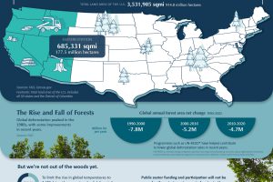
Deforestation over the last 30 years has led to a 177.5 million hectare reduction in world’s forests. See why these trends need to reverse swiftly in order to effectively manage… Read more
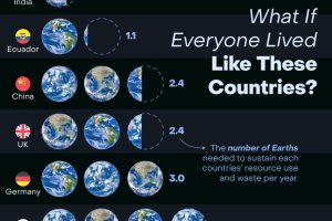
How many Earths would we need if the global population lived like Americans? This infographic answers this question and more. Read more
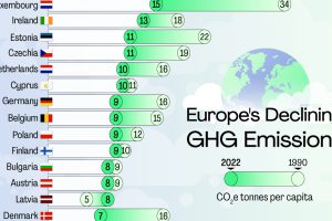
Across the continent, per capita emissions have come down since 1990. But there’s still a long way to go to net zero. Read more

Here’s a preview of the 2023 Utility Decarbonization Index, which tracks the decarbonization progress of the largest U.S. utilities. Read more


