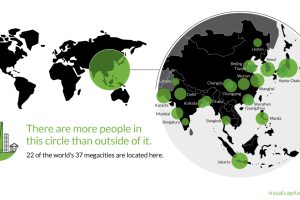
That’s right – nearly 4 billion people live inside the circle on this world map, including 22 of the world’s 37 megacities. Read more
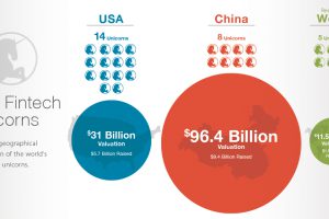
Does the U.S. or China have more valuable fintech startups? This data visualization breaks down fintech unicorns by valuations, money raised, and location. Read more
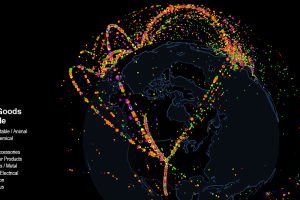
Use this interactive map to explore fascinating data on international trade. Which countries trade with each other, and which are stuck as hermits? Read more
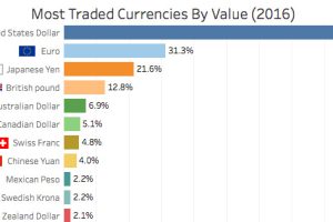
Here are the world’s most traded currencies in 2016 – and the surprisingly low spot in which bitcoin fits into the mix. Read more

From multi-billion dollar theme parks in Dubai to 48-year long canal projects to divert major rivers in China – these are the world’s largest megaprojects. Read more
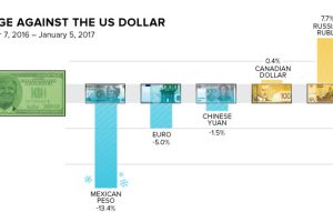
How does the Trump Effect impact currencies? Over the last two months, the peso has lost -13.4% in value, and the Russian ruble has gained 7.7%. Read more
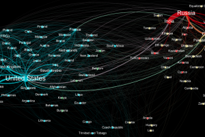
Who sends weapons to who? This data visualization represents the global weapons trade between countries, and it shines a light on two major blocs of trade. Read more
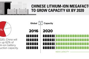
China’s li-ion battery production capacity will soon be 6x what it is today – and one of these megafactories may even be bigger than Tesla’s famous Gigafactory. Read more
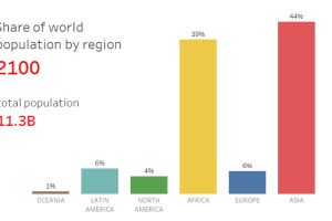
Based on data and projections from the U.N. Population Division, here is how the world’s population will shift between 1950 and 2100, sorted by region. Read more


