
Which countries dominate outer space? This visual displays the number of objects every country has launched into space over time. Read more
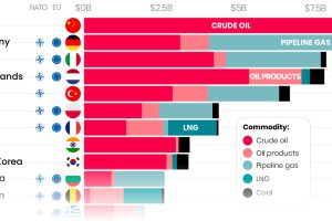
Here are the top importers of Russian fossil fuels since the start of the war. Read more
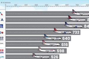
What type of aircraft do the world’s largest airlines use? This infographic breaks down the airline fleets of major carriers Read more
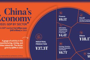
China’s economy reached a GDP of 114 trillion yuan ($18 trillion) in 2021, well above government targets. What sectors drove that growth? Read more
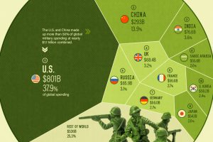
As geopolitical tensions began to heat up around the world, which nations were the top military spenders in 2021? Read more
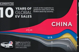
Global EV sales have grown exponentially, more than doubling in 2021 to 6.8 million units. Here’s a look at EV sales by country since 2011. Read more
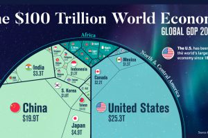
Despite ripple effects from conflict and inflation, global growth continues. According to the IMF, the global GDP will hit $104 trillion by end of year. Read more
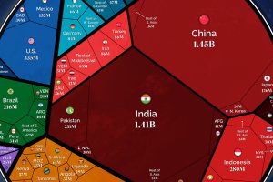
Our population will soon reach a new milestone—8 billion. These visualizations show where all those people are distributed around the world Read more

The supply chain is key for the renewable energy revolution, and this chart visualizes where the world’s solar panels are manufactured. Read more

The world’s most surveilled cities contain hundreds of thousands of cameras. View this infographic to see the data in perspective. Read more

