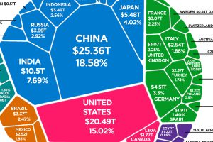
After adjusting GDP for purchasing power parity (PPP), here is how the composition of the world economy breaks down by country. Read more

This infographic explores how China’s proposed social credit system will monitor and surveil citizens, and how it’ll be used to reward or punish them. Read more

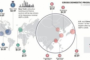
Cities are heavy hitters in the global economy. Where will the top 10 cities be in 2035—based on GDP, population, and annual growth? Read more

Russia has the most submarines, but the U.S. leads in technology. Read more

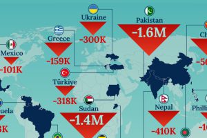
We map out which parts of the world are losing people to emigration basedon 2023 data. Noticeably, high income countries are underrepresented. Read more

All EU member states are required by law to ensure a minimum of 20 days (four weeks) of paid time off in their labor codes. Read more

More people doesn’t automatically equate to more Olympic medals, as some of the world’s most populous countries have found out over the years. Read more

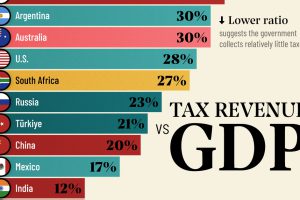
Measuring the ratio of tax revenue to economic size reveals the government’s ability to spend on public services. Read more


