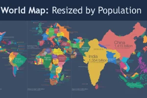
Look at global population in a whole new light, when countries on the world map are drawn based on population numbers instead of their usual borders. Read more
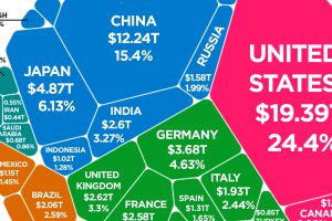
Latest estimates put the world economy at about $80 trillion in nominal GDP. Here is how each individual country stacks up in terms of size. Read more
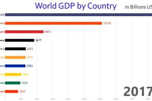
This rapid-paced animation shows year-by-year changes in GDP for the world’s 10 largest economies over the course of 57 years. Read more
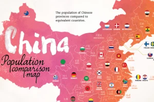
With 1.4 billion people living in the country’s 33 distinct regions, each of China’s provinces has a population that is equal to that of a major country. Read more
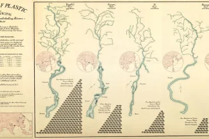
Every year, 8 million metric tons of plastic enters the world’s oceans – much of it through our river systems. See which rivers are polluting the most. Read more

These charts visualize the most valuable bank brands around the world, while also showing the rise of China’s financial services sector over time. Read more
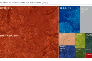
Global economics is effectively a numbers game – here are the countries and regions projected to contribute the most to global growth in 2019. Read more

It’s hard to ignore the massive economic opportunities available in the Chinese market, but it’s also notoriously difficult to succeed in. Read more
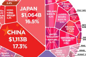
More than $6 trillion of U.S. debt is owned by foreign governments such as China or Japan. See how it all breaks down, and what it means. Read more
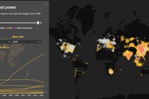
Today’s interactive map shows all of the world’s coal power plants, plotted by capacity and carbon emissions from 2000 until 2018. Read more

