

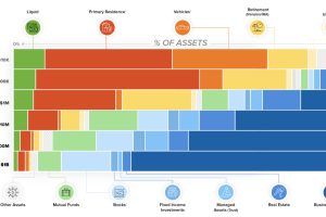
This chart breaks down the composition of assets for each tier of wealth. See what assets make up a regular person’s net worth, versus that of a billionaire. Read more

There is $360.6 trillion of wealth globally. This graphic shows how it breaks down by country, to show who owns all of the world’s wealth. Read more
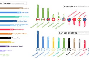
This quick graphic summary breaks down the final market numbers for 2019, looking at everything from currencies to broad asset classes. Read more
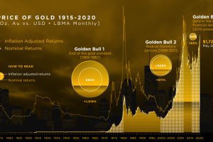
We break down gold’s three major bull markets over the last century. This includes the current one, in which gold has hit 8-year highs. Read more
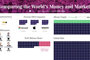
Our most famous visualization, updated for 2020 to show all global debt, wealth, money, and assets in one massive and mind-bending chart. Read more
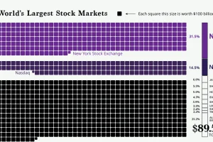
The world’s stock market exchanges have a combined market cap of $89.5 trillion, with American exchanges making up all most half that value. Read more
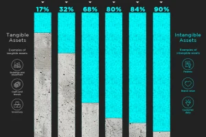
Intangible assets have increased as a portion of total assets in the S&P 500 for 45 years. Today they represent 90% of all assets. Read more
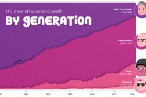
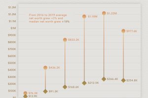
How large is the wealth gap between Millennials, Gen X, and Baby Boomers? We visualize the growing wealth disparity by generation and age. Read more
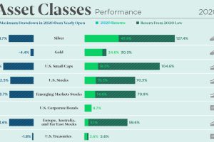
The markets were volatile but offered great opportunity in 2020. See how every asset class, currency, and S&P 500 sector performed over the year. Read more
How much is the average American worth at different ages? This chart reveals the average net worth by age in the U.S. Read more