

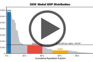
Watch the economies of the United States, China, and India evolve before your eyes from 1970 until 2030 (projected). Read more
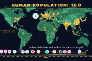
This animation captures 200,000 years of human population growth – see everything from the invention of farming to the impact of the Black Death. Read more
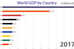
This rapid-paced animation shows year-by-year changes in GDP for the world’s 10 largest economies over the course of 57 years. Read more

This animation shows the population density of U.S. counties between 1790 and 2010, showing the westward expansion of the country’s population. Read more
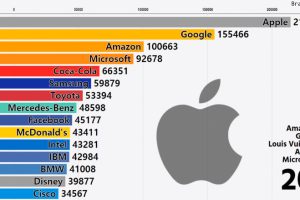
This stunning animation shows a dramatic change in the world’s most valuable global brands. Watch tech companies like Apple shoot up the rankings in style. Read more
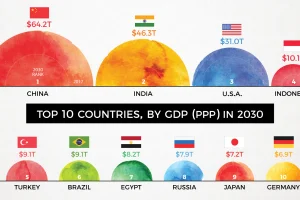
By 2030, the complexion of the global economy could look very different. This animation shows how the world’s biggest economies will change over time. Read more
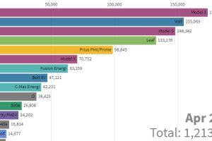
This stunning animation visualizes the last nine years of U.S. electric vehicle sales. We also look at who will lead the race in the coming years. Read more
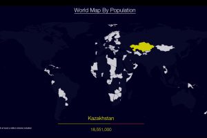
Watch countries appear one-by-one to form a cohesive world map, when they are ordered by population. Read more
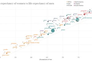
In just 65 years, global life expectancy has skyrocketed. See its ascent in this short animation, or dive into the interactive version for more data. Read more
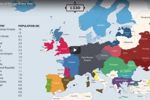
The history of Europe is breathtakingly complex, but this animation helps makes sense of 2,400 years of change on the European map. Read more