

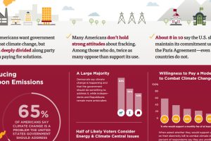
This survey of over 1,000 Americans tells you what people actually believe about fracking, coal, climate change, and other hot button energy issues in the U.S. Read more
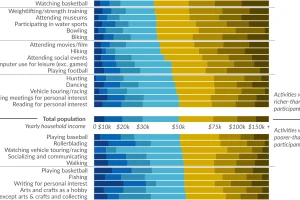
Ever wonder how people spend time? This data visualization shows favorite American past-times like playing baseball or watching TV by using income brackets. Read more

See how financially literate you are by answering this very short quiz. Can you get more than two questions right? (If so, you beat the average American) Read more
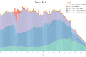
This interactive infographic allows you sort data on the U.S. population using a variety of topics, to see how Americans differ by age. Read more
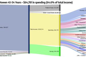
These interesting diagrams break down how Americans of different age groups earn and spend their money, and what the money goes towards. Read more
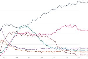
Ever wondered who Americans spend the most time with? This chart assesses how many minutes per day Americans spend with different people. Read more
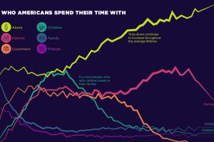
Social connections evolve throughout our lifetimes. Here we chart how much time Americans spend with others, and who that time is spent with. Read more

To offer perspective on the population of U.S. states, this map compares them to countries that share similar population sizes. Read more
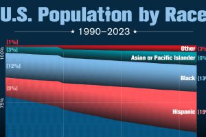
The nation’s non-white population has nearly doubled since 1990. Read more