

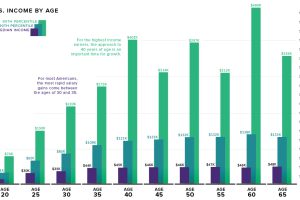
What is the relationship between age and income level? We visualize the data and compare it to commonly held beliefs on the topic. Read more
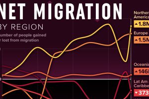
We visualized net migration statistics from the United Nations to gain insight into the flow of people globally. Read more
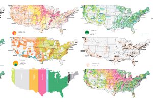
The U.S. covers an immense 3.8 million square miles—what is all this land currently used for, and what does that mean for the future? Read more
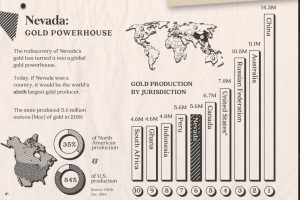
Nevada accounts for 84% of U.S. gold production today. Here’s a look at the state’s rich history, its prolific production, and what the future may hold. Read more
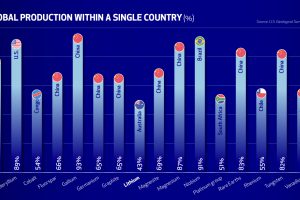
The U.S. finds itself in a precarious position, depending largely on China and other foreign nations for the critical minerals needed in the new energy era. Read more

Since the 1990s, the opioid crisis has claimed thousands of lives. This visualization shows how the epidemic has come in three distinct waves. Read more
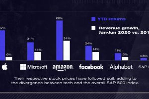
After a strong start to 2020, U.S. tech giants continue to advance to unprecedented highs. The Big Five now account for 25% of the S&P 500. Read more
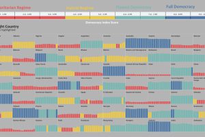
Has the world become more or less free? To find out, this graphic highlights the changing state of democracy in 167 countries since 2006. Read more
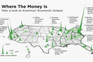
The total U.S. GDP stands at a whopping $21 trillion, but which metro areas contribute to the most in terms of economic output? Read more
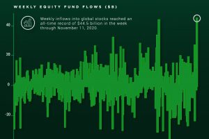
Investor optimism regarding vaccine news and the U.S. presidential election has led to record breaking inflows into the stock market. Read more