

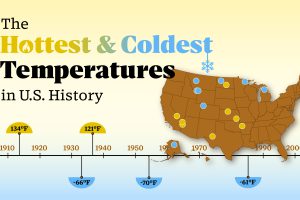
The highest temperature was registered in Death Valley, California, in 1913. Read more

Election day is finally here. Here’s 10 charts and maps that will be central to the story as America makes its historical decision. Read more
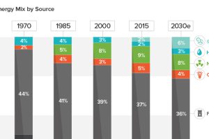
See how America’s energy mix has evolved from 1970 until today, as well as a projection for the energy sources to be used in the year 2030. Read more

American whiskey is experiencing an impressive resurgence, but the road to the current bourbon boom hasn’t always been smooth. Read more
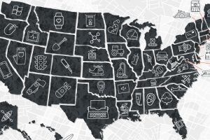
Many U.S. inventions, such as the internet or airplane, have had a profound impact on the world. Here’s each state’s most important invention. Read more
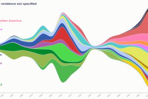
This series of maps and visualizations shows immigration in America starting in 1820. We also look at who identifies as having American ancestry today. Read more
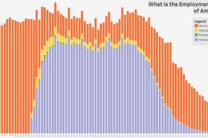
These three charts show the age distribution of the U.S. population, further broken down by employment status, education, and marital status. Read more

Where and how do Americans get their news—as revealed by a YouGov survey tracking the most used news sources on a weekly basis. Read more
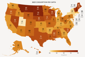
A data-driven look at consumption of America’s most popular alcoholic beverage: beer. Read more
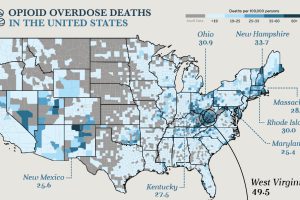
Drug overdoses are the leading cause of death for Americans under the age of 50. A hard look at the numbers behind this unparalleled public health crisis. Read more