


The Mark Zuckerbergs of the world get all the credit. Here’s the story on older entrepreneurs that have been wildly successful, founding big companies. Read more
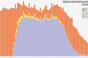
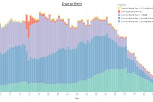
These three charts show the age distribution of the U.S. population, further broken down by employment status, education, and marital status. Read more
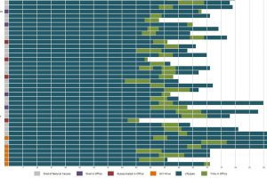
When do presidents start their first terms, on average? Who were the youngest and oldest presidents? It’s all here in this visualization. Read more

The average age for adults to move out in the top seven countries—all from the same region—is either at or above 30. Read more
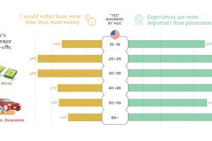
We look at how the trade-off of time and money is viewed between different generations, as well as the international differences between countries. Read more
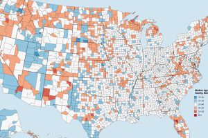
Which counties have the youngest populations, and which are meccas for aging retirees? This map shows the median age of every county in the United States. Read more
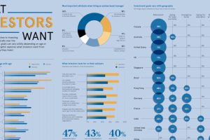
Are all investors saving for retirement, or do they have other investment goals in mind? Here’s a look at goals sorted by geography and generation. Read more
How do countries around the world compare in terms of age? This compelling visualization shows the median age for every country in the world. Read more
This interactive infographic allows you sort data on the U.S. population using a variety of topics, to see how Americans differ by age. Read more
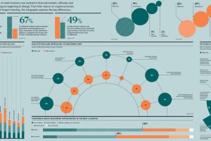
Each generation was shaped by unique circumstances, and these differences translate directly to the investing world as well. Read more