

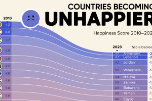
Tracking Gallup survey data for more than a decade reveals some countries are witnessing big happiness declines, reflecting their shifting socio-economic conditions. Read more
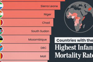
We visualize the 15 countries with the highest infant mortality rates, including countries from Africa and the Middle East. Read more
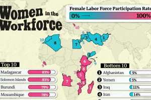
More women in the workforce can indicate a shift towards women having more economic opportunities and facing fewer barriers to working outside the home. Read more
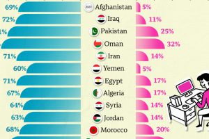
Tracking the difference between male and female labor force participation rates reveals large gender disparities for women at work. Read more
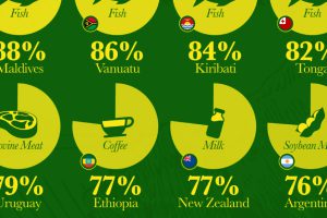
Which countries are most heavily dependent on agricultural exports to fuel their economies? We visualize the data in this chart. Read more

Metrics assessing safety, inclusion, and access to justice vary greatly by country. Which were the worst countries for women in 2023? Read more
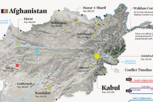
This map explainer looks at Afghanistan from a structural point of view, delving into geography and population patterns. Read more

Every day, hunger affects more than 700 million people. This live map from the UN highlights where hunger is hitting hardest around the world. Read more

From presidential elections, to cryptocurrencies and billionaires, here are the trending searches in every U.S. state in 2021. Read more
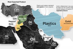
It’s more than just oil. This map of Middle East exports shows the top global product of each country by value. Read more