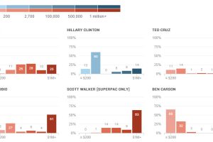
The candidates for the 2016 presidential race are employing a variety of strategies to fund their campaigns. Here’s a breakdown of funding by donation size. Read more
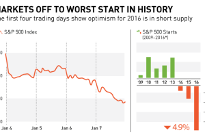
In this chart and post, we show why markets are off to their worst start in history. We also look at recent S&P 500 starts to show an interesting trend. Read more
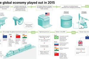
This infographic recaps economic events and sentiment in 2015. Should investors approach the new year with renewed optimism or brace for volatility? Read more

We look at 3 major themes that may suggest it is worth owning gold in 2016, ranging from the end of two-term US presidential terms to the gold-to-oil ratio. Read more

Election day is finally here. Here’s 10 charts and maps that will be central to the story as America makes its historical decision. Read more
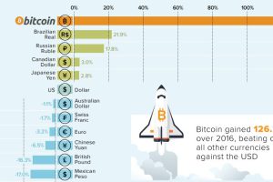
Bitcoin is no stranger to extremes: in each of the last four years, it has been either the best or worst performing currency, with nothing in between. Read more
We roundup the best infographics, charts, and data visualizations that were posted over the year. Don’t miss Visual Capitalist’s Top Infographics of 2016! Read more


