In 2019, we launched our premium newsletter and community, called VC+, as a way to give our most passionate supporters even more visuals that help in explaining the world.
But we’re a data-driven brand—and we’ve been listening closely to our thousands of VC+ members. Based on their feedback, it was very clear how we could make the VC+ experience far more valuable and worthwhile for our members.
So, we’ve doubled down on the most popular part of VC+ and we think you’re going to like how it makes your life easier.
Learn about it more below, see what’s on tap for November, and get free samples of what’s been sent to VC+ members recently.
The Trendline
PREMIUM NEWSLETTER: Our Bi-Weekly Newsletter for VC+ Members
The Sunday Edition The Midweek Edition
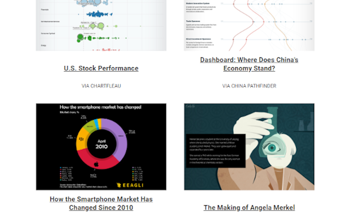
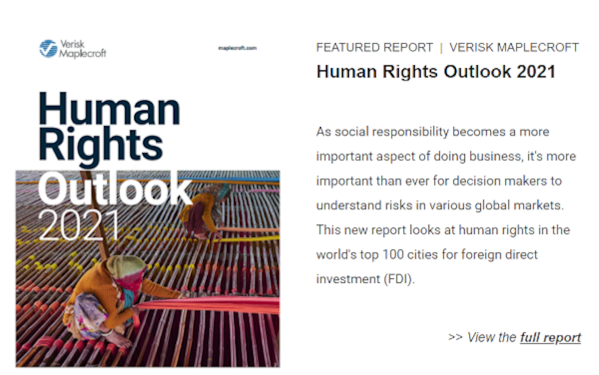
The Best Visualizations Each Week The Best Data and Reports Each Week
>> View free sample >> View free sample
Before, members received The Trendline newsletter once a week. But now, we’ve doubled the dose—members now receive The Trendline twice a week.
On Sundays, we highlight the best visualizations on business, investing, and global trends that our editors have uncovered. On Thursdays in the Midweek Edition, we send you a round-up of the most interesting reports we find along with key charts and commentary.
In addition to The Trendline, we’ll also be serving up two special features each month. What’s on for November?
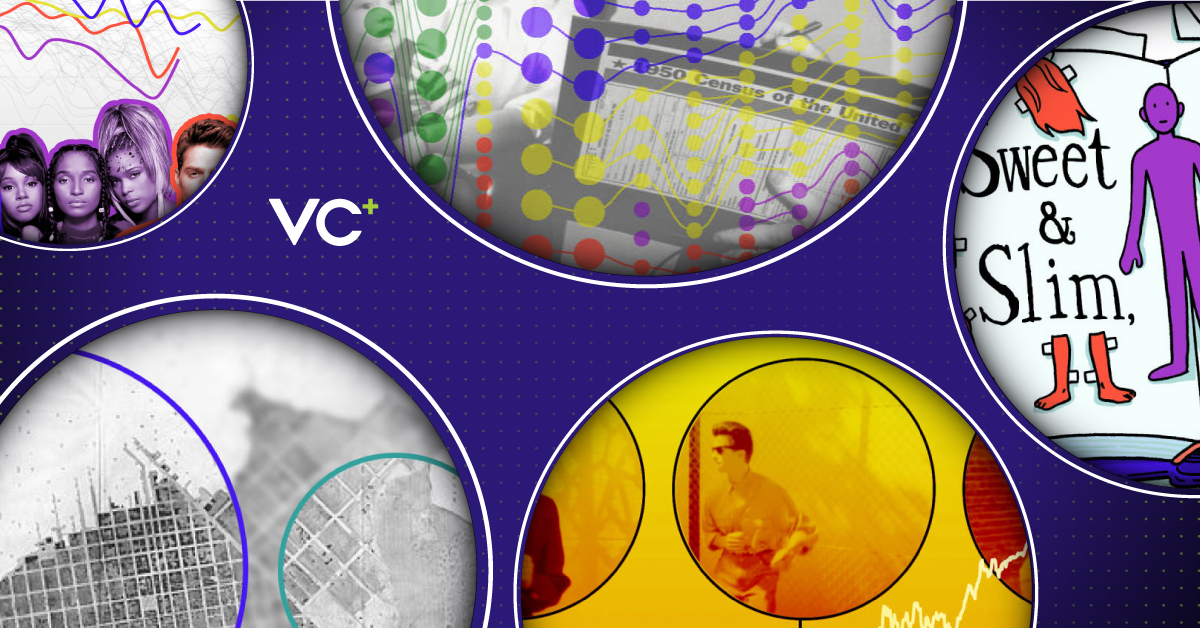
“The Best of… The Pudding”
SPECIAL DISPATCH: A Roundup From Our Favorite Publishers
During our research and writing processes, we often stumble upon resources that catch our attention—and sometimes, make us wish we’d thought of it first.
In this VC+ Special Dispatch, we curate the best of content libraries that we’ve come across in our internet journeys, for your easy viewing.
This edition looks at The Pudding—an online collection of visual essays founded by Matt Daniels that covers everything from demographics to pop culture.
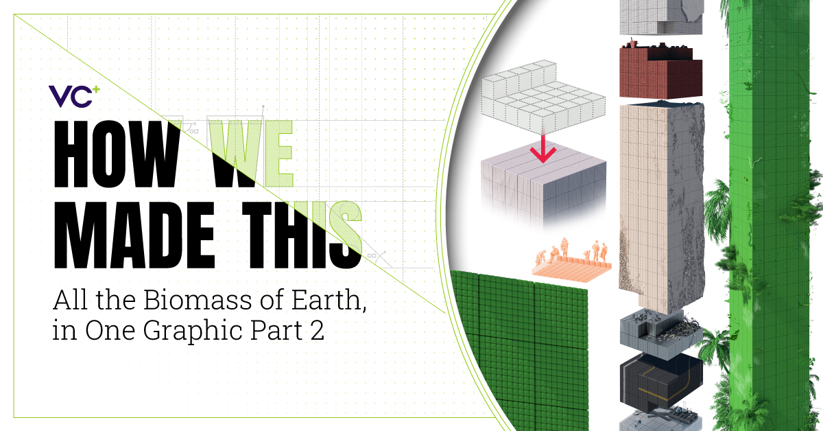
“How We Made This: All the Biomass on Earth, In One Graphic – Part 2”
SPECIAL DISPATCH: Behind the Scenes on Content Creation
For over a decade, the Visual Capitalist team has worked on thousands of infographics. We’ve learned a lot along the way, and we’re excited to share our process with you.
This month our Visual Scientific Communications Specialist, Mark Belan, takes us behind the scenes of his latest project—a detailed graphic that outlines the different types of biomass on Earth and shows how much of it is human-made.
Limited Time Offer
Get access to these upcoming features by becoming a VC+ member.
For a limited time get 25% off, making your subscription the same price as a coffee each month:
P.S. – We look forward to sending you even more great visuals and data!


