Mapping the Most Populous Countries, in Ascending Order
To keep information from getting stale, it can be worth changing things up.
One way to do this is to present data in a different way than what is traditionally expected, enabling a fresh perspective of the same information.
Today’s animated map comes to us from Reddit user notoriousstats, and it provides another angle of looking at a traditional world map: by plotting countries in the order of ascending populations, from the least populated to the most populated.
Filling a Map from Scratch
In the above animation, countries are added onto the map in sequence — each must have a minimum population of 1 million people — going from Swaziland (now officially known as Eswatini) all the way up to China.
It’s a visual trick that helps trigger some new insights, specifically about the population density of countries and continents. Let’s dive into a couple things that stood out.
Insights on Population Density
We naturally assume that the bigger a country is, the more people it usually has.
However, when we watch an animation like this, it becomes clear that this is not often the case. In fact, many large countries appear on the map early on — taking massive amounts of geographic real estate, but with very low populations.
Below is a list of the 10 countries with the lowest population densities on the planet:
| Rank | Country | Population | Density (sq. km) | Density (sq. mi) |
|---|---|---|---|---|
| #1 | 🇲🇳 Mongolia | 3,225,000 | 2.08 | 5.38 |
| #2 | 🇳🇦 Namibia | 2,495,000 | 3.03 | 7.85 |
| #3 | 🇦🇺 Australia | 25,203,000 | 3.30 | 8.55 |
| #4 | 🇱🇾 Libya | 6,777,000 | 3.85 | 9.98 |
| #5 | 🇧🇼 Botswana | 2,304,000 | 4.07 | 10.53 |
| #6 | 🇨🇦 Canada | 37,411,000 | 4.11 | 10.66 |
| #7 | 🇲🇷 Mauritania | 4,526,000 | 4.41 | 11.43 |
| #8 | 🇰🇿 Kazakhstan | 18,551,000 | 6.87 | 17.80 |
| #9 | 🇨🇫 Central African Rep. | 4,745,000 | 7.62 | 19.73 |
| #10 | 🇬🇦 Gabon | 2,173,000 | 8.43 | 21.84 |
Using this and the map as reference, what stands out?
Africa in Focus
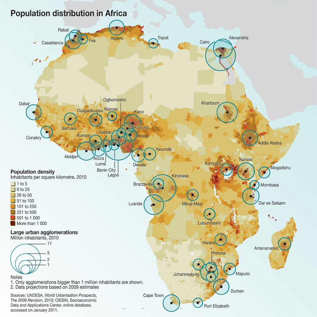
Africa has over 1.2 billion people living on it, so we often think of the continent as having a fairly high population density.
However, if you watch the animation, you’ll notice that many of the first countries appearing on the map are African — in fact, six of the 10 least densely populated countries in the world are on the continent: Namibia, Libya, Botswana, Mauritania, Central African Republic, and Gabon.

The reason for this lack of population density lies partly in geography.
We are all familiar with the vast extent of the Sahara (which makes most of Libya and Maritania desolate), but have you heard of the Namib or Kalahari deserts in the south?
The Namib takes away Namibia’s entire coastline, while the Kalahari makes most of Botswana and parts of Namibia almost inhospitable.
Juxtapositions
The animated map also creates some eye-popping juxtapositions between countries, which are appearing in order of population.
For example, Australia and North Korea appear in sequence. Both have about 26 million people, but Australia has a landmass that is about 63 times as large.
Russia and Bangladesh are also back-to-back; Russia has 145 million people, while Bangladesh has 163 million. Yet, if Russia had the population density of Bangladesh, it would be home to 19 billion people, which is three times the current global total.
Changing Perspectives
If we always look at things the same way, it’s hard to notice something new.
Each time we view a map from a different angle, it creates the opportunity to discover new insights. This same thought process can be applied to other areas of life, so that we can always be learning — and data never gets stale.


