World Map: Divided Into 4 Regions With Equal Populations
View the full-size version of the infographic by clicking here
At the most basic level, a standard world map tells us almost nothing about human population.
While the borders on a map may give us an idea of political boundaries or even aspects of continental geography, in reality they have little to do with showing population density.
That said, it is possible to apply one simple alteration to the world map so that we can make it more interesting from a population perspective – and it turns out that doing so can help us gain insight on where regional population density is the greatest.
Splitting Up the Map
Today’s map comes from Reddit user /u/OrneryThroat and it breaks up the world by grouping countries into four equally populated regions.
While both simple and crude, this mechanism does have some profound results:
| Region | Population |
|---|---|
| North America, South America, and West/Central Africa | 1.9 billion |
| Europe, East Africa, Middle East, and Northern Asia | 1.9 billion |
| South Asia | 1.9 billion |
| Most of Southeast Asia, China, and Oceania | 1.9 billion |
More specifically, there is one area that stands out from a visual standpoint, and it resides clearly in the southern portion of Asia.
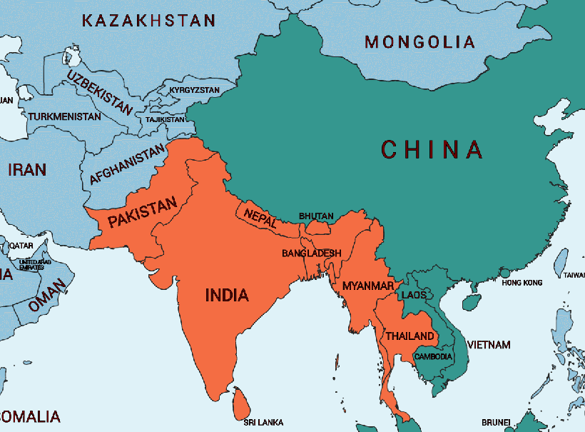
Home to 1.34 billion people, it’s well-known that India already holds roughly 20% of the global population – but add Pakistan (195 million) and Bangladesh (165 million) into the mix, and you’re already closing in on one quarter of the global total.
Meanwhile, to get to a similar number, you’d need to add the entire populations of North America, South America, Europe, and Oceania together to even come close.
Shown Another Way
While splitting it into four equal portions is one way to transform the world map, here is another geometric route to conveying a similar idea about the world’s population density:
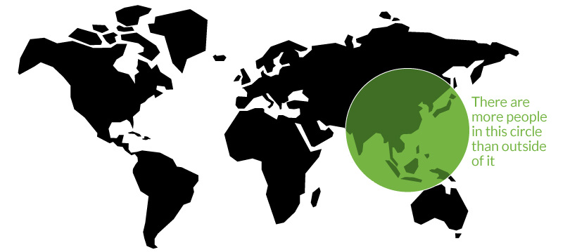
On a previous Chart of the Week, we showed that 22 of the world’s 37 megacities are located in the small circle above, putting into perspective the region’s population density in a similar but different way.
These simple transformations of the world map are not only memorable, but they also give our brain an easy heuristic to better understand the planet we live on.


