This Map Shows Every Power Plant in the United States
Every year, the United States generates 4,000 million MWh of electricity from utility-scale sources.
While the majority comes from fossil fuels like natural gas (32.1%) and coal (29.9%), there are also many other minor sources that feed into the grid, ranging from biomass to geothermal.
Do you know where your electricity comes from?
The Big Picture View
Today’s series of maps come from Weber State University, and they use information from the EPA’s eGRID databases to show every utility-scale power plant in the country.
Use the white slider in the middle below to see how things have changed between 2007 and 2016:
The biggest difference between the two maps is the reduced role of coal, which is no longer the most dominant energy source in the country. You can also see many smaller-scale wind and solar dots appear throughout the appropriate regions.
Here’s a similar look at how the energy mix has changed in the United States over the last 70 years:
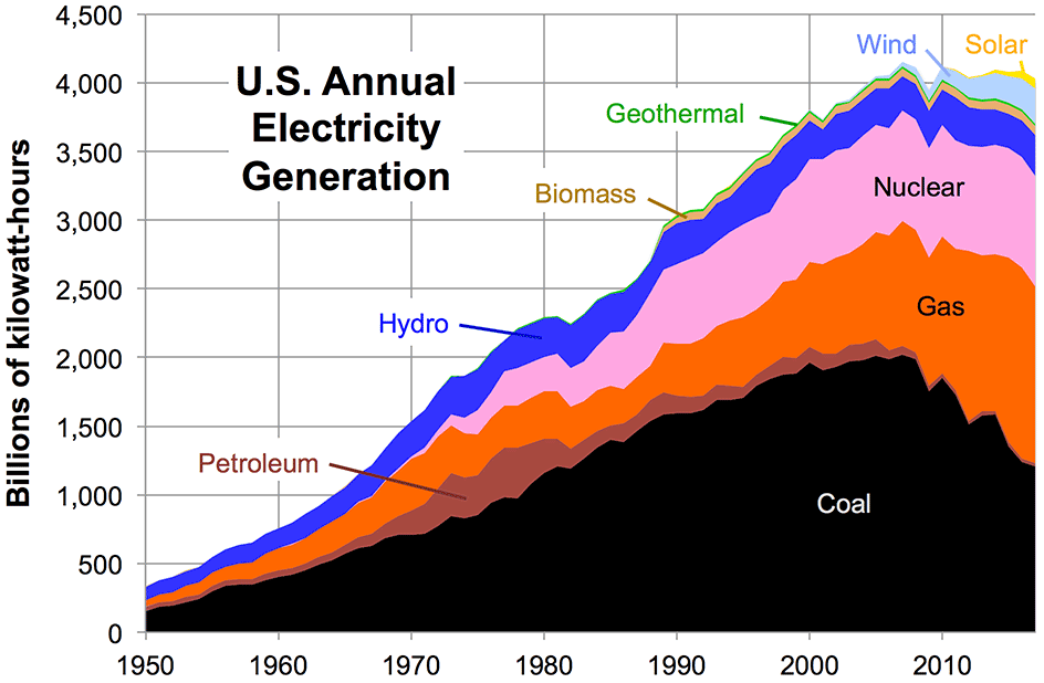
Up until the 21st century, power almost always came from fossil fuels, nuclear, or hydro sources. More recently, we can see different streams of renewables making a dent in the mix.
Maps by Source
Now let’s look at how these maps look by individual sources to see regional differences more clearly.
Here’s the map only showing fossil fuels.
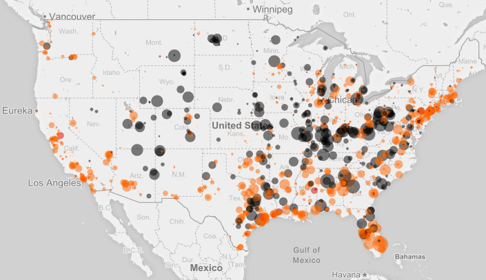
The two most prominent sources are coal (black) and natural gas (orange), and they combine to make up about 60% of total annual net generation.
Now here’s just nuclear on the map:
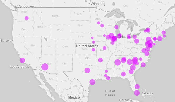
Nuclear is pretty uncommon on the western half of the country, but on the Eastern Seaboard and in the Midwest, it is a major power source. All in all, it makes up about 20% of the annual net generation mix.
Finally, a look at renewable energy:
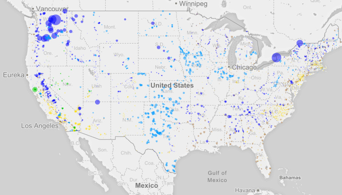
Hydro (dark blue), wind (light blue), solar (yellow), biomass (brown), and geothermal (green) all appear here.
Aside from a few massive hydro installations – such as the Grand Coulee Dam in Washington State (19 million MWh per year) – most renewable installations are on a smaller scale.
Generally speaking, renewable sources are also more dependent on geography. You can’t put geothermal in an area where there is no thermal energy in the ground, or wind where there is mostly calm weather. For this reason, the dispersion of green sources around the country is also quite interesting to look at.
See all of the above, as well as Hawaii and Alaska, in an interactive map here.


