In today’s tech-driven economy, data is essential for gaining new insights, making decisions, and building products.
In fact, there is so much data out there, that the quantity of it is doubling every two years—and by 2025, there will be 175,000 exabytes of data in existence.
This is an unprecedented figure, and it’s hard to put into perspective. To give you some sense, a single exabyte is equal to 1,000,000,000 GB of data, and five exabytes has been said to be roughly equal to “all of the words ever spoken by mankind”.
Common Fallacies With Data
As you can imagine, digging through all of this data can be quite the challenge.
Data comes in many different forms and not all of them are easy to analyze. As a result, it is tempting to take shortcuts with data, or to try and fit the incoming data we receive into our pre-conceived notions of how things ought to be.
Today’s infographic comes to us from Geckoboard and it shows the common mistakes that people make in analyzing data. We’ve reformatted their PDF to fit here.
15 Common Data Fallacies

How do we avoid painting a bullseye around the arrow, so that we can interpret the meaning of data in a logical, consistent, and methodological way?
The key is to understand common mistakes that people make with data, and why these errors skew our interpretations.
Examples of Fallacies
Here are four examples of fallacies, and why each is considered a faux-pas by data scientists.
1. Survivorship Bias
When people analyze the qualities it takes to be a successful entrepreneur, we typically look at the existing population of established entrepreneurs for clues. However, by limiting our sample just to this “surviving” group of entrepreneurs, we run the risk of survivorship bias.
There are lessons we can learn from all of the entrepreneurs who have failed—they are just much harder to find. Integrating that data into the story can help complete a much fuller picture.
2. False Causality
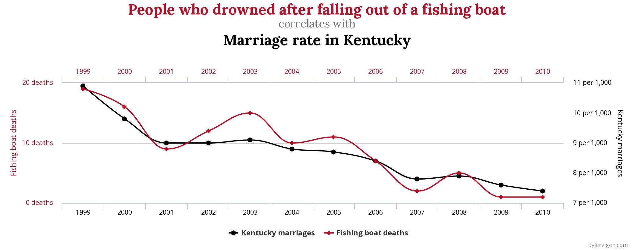
Did you know that there is a 95% correlation between the marriage rate in Kentucky and the amount of people who drown each year from falling out of fishing boats? (See it, and other bizarre correlations here)

Does this mean that there is some sort of relationship between the two variables?
Finding a high level of correlation can happen simply by chance—but awarding false causality is one of the most amateur statistical mistakes in the book.
3. The Gambler’s Fallacy
If the roulette wheel turns up black for 26 times in a row, does that mean that it will revert back to red on the next spin?
It’s easy to say that the odds don’t change, but imagine being in the moment. The Gambler’s Fallacy happens with data analysis as well: just because something happens unusually frequently over a period of time doesn’t mean that nature will “even it out”.
4. The Cobra Effect
Data can be used to measure progress in achieving business goals, but what if there is incentive to game these goals?
Wells Fargo, in an effort to upsell existing clients, introduced an incentive called “eight is great”. In short, their employees were encouraged to sell eight accounts per customer, which could take the form of credit cards, savings accounts, and other financial services.
In an example of good intentions gone awry, Wells Fargo employees began breaking the rules to meet their targets. Millions of unauthorized credit card and deposit accounts were opened based on this perverse incentive, and the bank was eventually ordered to pay a $142 million settlement.


