From the day of birth, most Americans are told by society that their life should follow a certain trajectory: go to school, get a higher education, get married, start a career, and retire as soon as they are gray and old.
For many people, their life story plays out exactly like this – but people actually do it at very different speeds, or people end up hitting these milestones in different orders. Meanwhile, some Americans deviate from the typical path altogether, forging their own unique stories.
Charting Life Events
Interestingly, all of these landmark life events can be viewed through the lens of demographics, and today’s charts from Overflow Data help to tell this tale. In the below charts, we’ll look at education, employment, and marital status all visualized based on a spectrum of age.
The end result? You’ll see when people hit certain landmarks such as graduating from college, getting married, or getting a job. You’ll also see an alternate perspective as well, such as the points in time where millions of people are outside of the workforce, or when divorce rates spike.
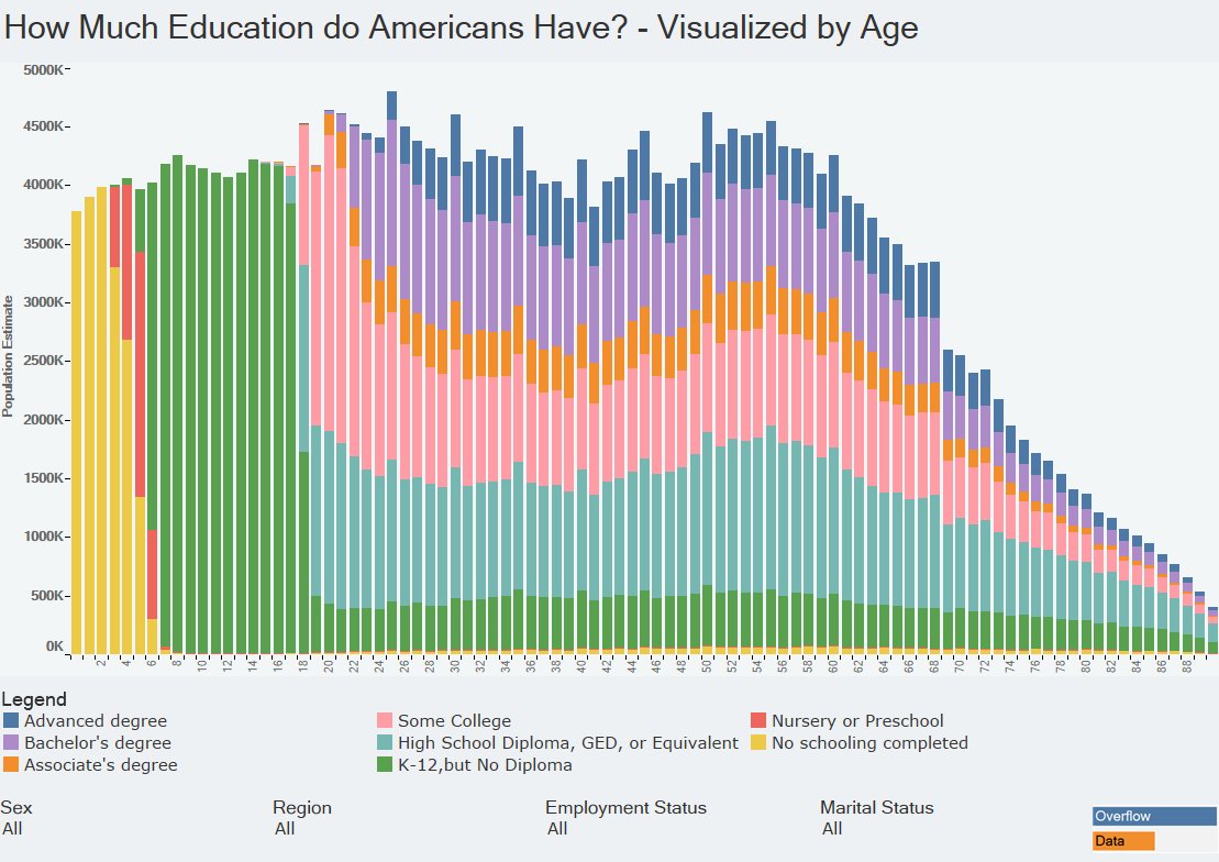
Getting an Education
The below chart shows the American population by age, sorted by the level of education attained.
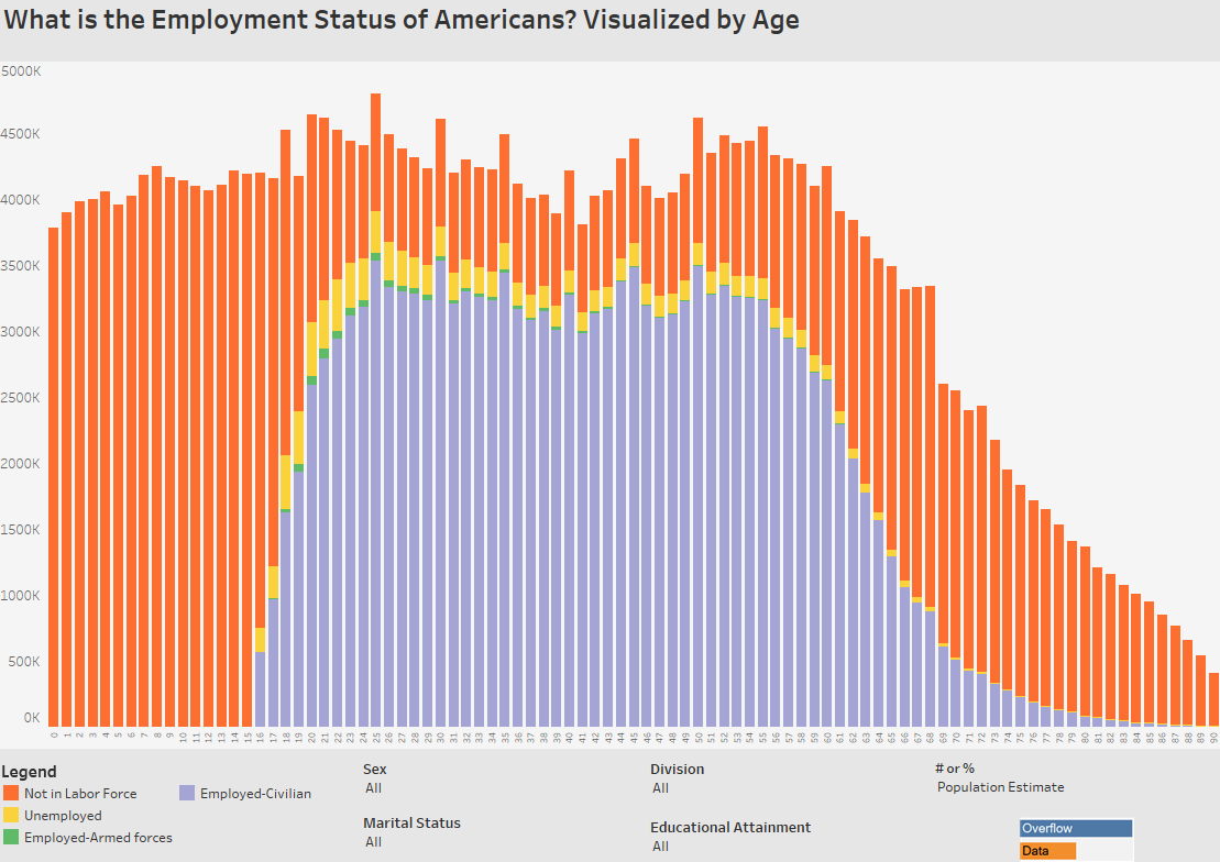
Getting a Job
Next, here is the U.S. population by age, sorted by status in the labor force.
Getting Married
The below chart shows the American population by age, sorted by marital status.

Even though each person charts their own unique course in life, it is interesting to look at the data in aggregate as well.
From these three charts we can see when most major life events occur, and they help to paint an even bigger picture of the lives of the 323 million people in the U.S. population.


