Chart: The Rate of Change in U.S. Energy Consumption
This chart shows the winners and losers in energy sources used
The Chart of the Week is a weekly Visual Capitalist feature on Fridays.
Weeks ago, we published a flow chart that showed all U.S. energy consumption from 2015 in one giant diagram.
This is a great tool for understanding a static picture of U.S. energy consumption – it breaks down the energy sources, as well as the details about where the energy ultimately flows. It also shows that a large amount of energy potential, about 61%, is inevitably “wasted” due to the laws of physics as well as inefficient processes.
However, because it is a static view of one year, it ends up doing a poor job of encapsulating how the energy sector is shifting. This week’s chart shows the changing landscape for different energy sources in the United States.
Examining the Shift in U.S. Energy Consumption
As a starting point, based on the aforementioned diagram of energy usage, let’s look at the composition of the energy mix:
- Oil: 36%
- Natural gas: 29%
- Coal: 16%
- Renewables: 10%
- Nuclear: 9%
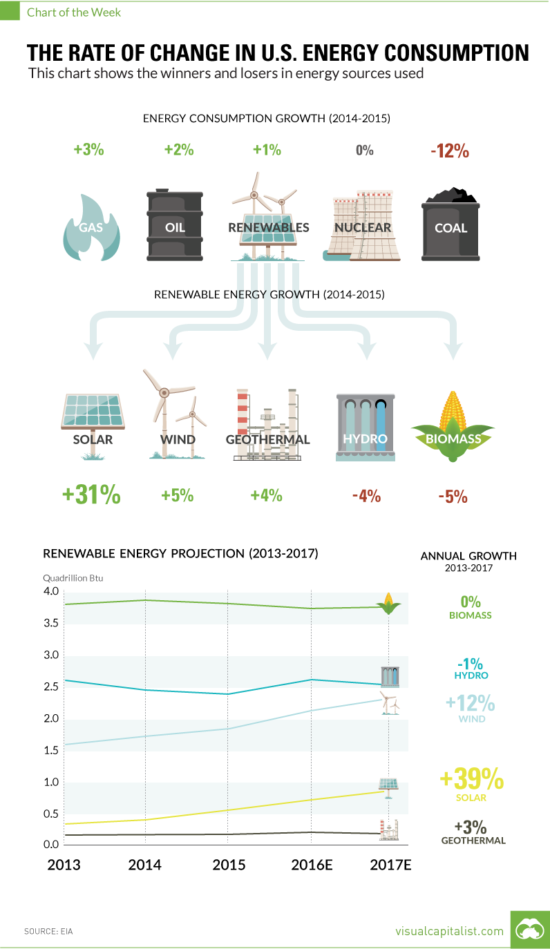
Now, let’s look at the rate of change of these broad categories between 2014 and 2015 according to the EIA:
- Oil: +2%
- Natural gas: +3%
- Coal: -12%
- Renewables: +1%
- Nuclear: 0%
On a macro level, the first obvious note is that coal consumption dropped rapidly in 2015. This, along with other factors, is why many people are declaring that coal is dead.
Another interesting observation is that renewables only increased by 1% in consumption. This seems strange, considering that there is such hype around things like the Tesla Gigafactory and the surging demand for lithium-ion batteries. Diving a bit deeper will provide an explanation for this.
Renewable Energy
There are five main components that make up U.S. renewable energy: solar, wind, hydro, geothermal, and biomass.
The biggest sub-sector is biomass, which made up about 43% of all renewable usage in the United States in 2015. Hydro is also significant, as it is 27% of the renewable total. However, as you will see, consumption in biomass and hydro dropped between 2014 and 2015:
- Biomass: -5%
- Hydro: -4%
- Wind: +5%
- Solar: +31%
- Geothermal: +4%
Even though the biomass and hydro consumption dropped, the future of renewables is in good hands. In particular, it has been the miraculous change in the price per watt of solar energy that has changed the landscape. Solar energy consumption, even though it is a relatively small number compared to other energy sources, increased by 31% in 2015.
As a final point, here is the data and projections going out to 2017 for the main renewable sources, according to the EIA. Note that solar’s CAGR (compound annual growth rate) is 39% between 2013 and the projected 2017 number.
Renewable energy consumption (Quadrillion Btu, 2015)
| 2013 | 2014 | 2015 | 2016e | 2017e | CAGR (2013-2017) | |
|---|---|---|---|---|---|---|
| Solar | 0.31 | 0.42 | 0.55 | 0.66 | 0.82 | 39% |
| Geothermal | 0.21 | 0.21 | 0.22 | 0.23 | 0.23 | 3% |
| Wind | 1.60 | 1.73 | 1.81 | 2.08 | 2.26 | 12% |
| Hydro | 2.56 | 2.47 | 2.39 | 2.57 | 2.52 | -1% |
| Biomass | 3.76 | 3.93 | 3.77 | 3.74 | 3.75 | 0% |


