

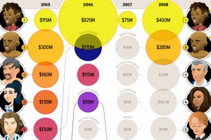
Celebrity status can be a powerful tool for building a fortune. These infographics visualize the world’s top earning celebrities, both living and dead. Read more
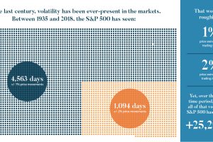
We look at the last century of markets to discover five important lessons about volatility. Here’s what you should know about volatility going forward. Read more
Where do the world’s top billionaires live, and how has this distribution changed over time? We take a look at the top 50 billionaires . Read more

These charts break down how Americans get their income, as well as where that money goes, based on different income groups. Read more
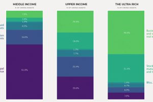
Today’s chart shows how the composition of wealth tends to change as net worth increases, illustrating the building blocks that make up household net worth. Read more
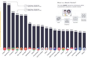
This telling chart shows how national wealth markets have changed over the past decade, highlighting the biggest winners and losers. Read more
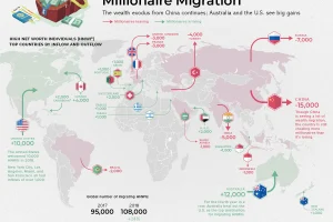
Which countries are magnets for the world’s rich, and which countries are seeing a wealth exodus? Mapping the migration of the world’s millionaires. Read more
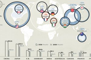
These countries hold 74% of the world’s $204 trillion in private wealth. See the 10 richest countries, and how their totals have changed over time. Read more
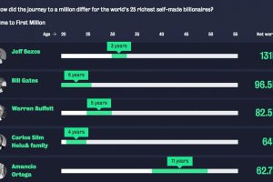
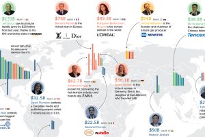
For the world’s wealthiest self-made billionaires, how long did it take to earn the very first $1 million of their vast fortunes? Read more

This video highlights the basics of the stock market, how they work, and also the history of how the first markets got started. Read more